Westport
Westport
Westport
Client
Edenshaw
Discipline
Residential Real Estate
Location
Port Credit, Ontario
Architect
IBI Group
Interior Design
Cecconi Simone
Architectural Renderings
Norm Li
Westport is a new condominium collection that offers the convenience of modern dwelling, balanced with a pace of life that is truly unique to Port Credit. Edenshaw, a prominent property developer and community leader, engaged Vanderbrand to develop a name and accompanying brand strategy that would inspire and excite the public about the future of Mississauga living.
Westport is Edenshaw’s newest residential project, located directly adjacent to the Port Credit GO Station and future Hurontario LRT Line. Driven by Edenshaw’s ongoing commitment to develop Port Credit in a responsible and sustainable manner, Vanderbrand devised a launch strategy that effectively communicated the relationship between connectivity and nature that defines the neighbourhood. A contemporary approach for the area, Vanderbrand established a clean and fresh visual language punctuated by engaging messaging and storied visuals to capture Edenshaw’s vision for a future-forward Port Credit.
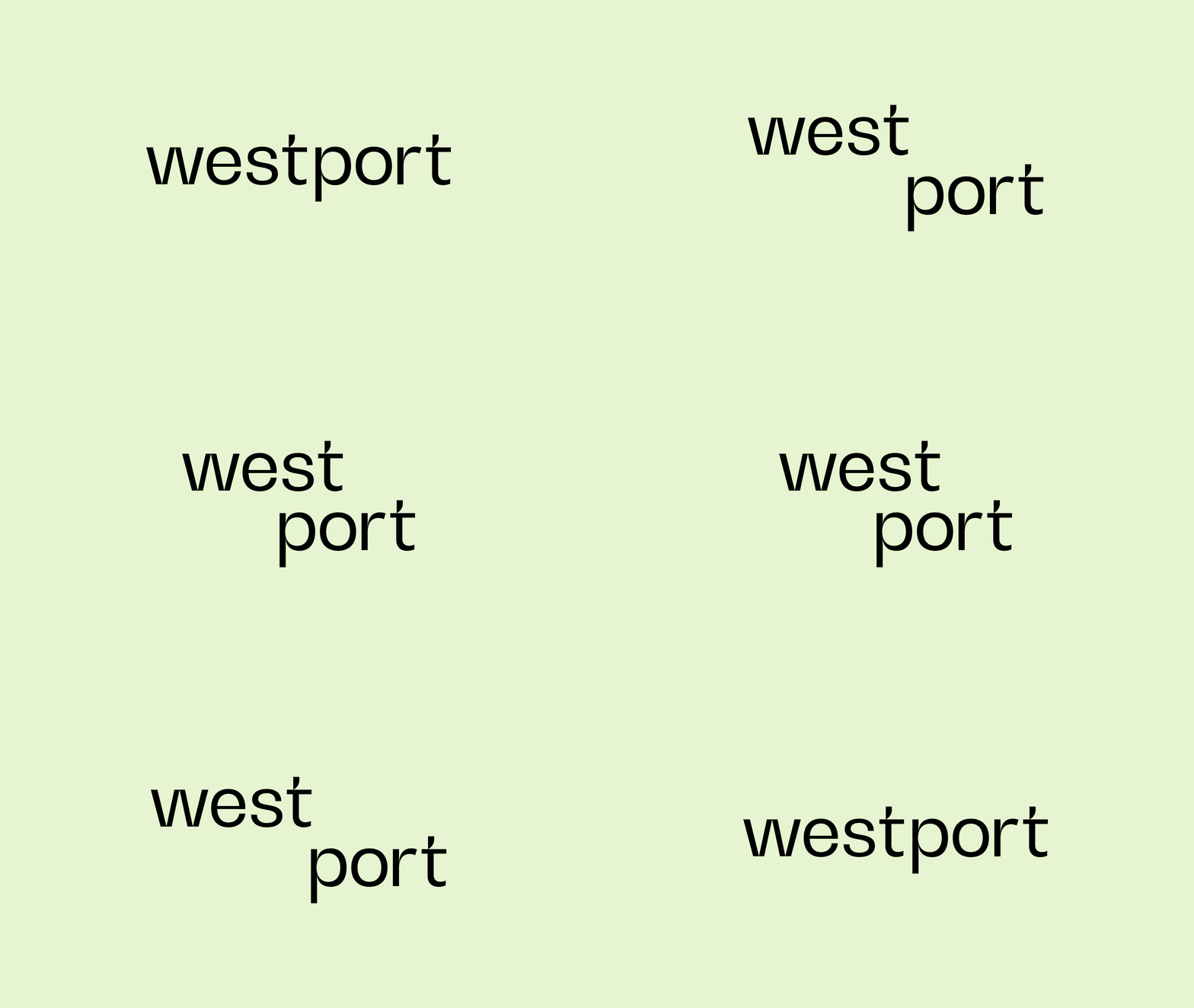
The name Westport captures the two most prominent strengths of the project site; its connected location west of Toronto, and its abundance of public, highly accessible waterfront land. The font features unique notches in the letterforms, giving a contemporary edge to a name that feels sophisticated and established. The modernity of the logo is pushed further by its lowercase typesetting, imbuing the name with a youthful energy that aims to inspire and engage potential purchasers.
Flexible and dynamic, the wordmark pulls apart and comes together to maximize visibility on all applications, allowing for optimal brand recognition across print and digital platforms.
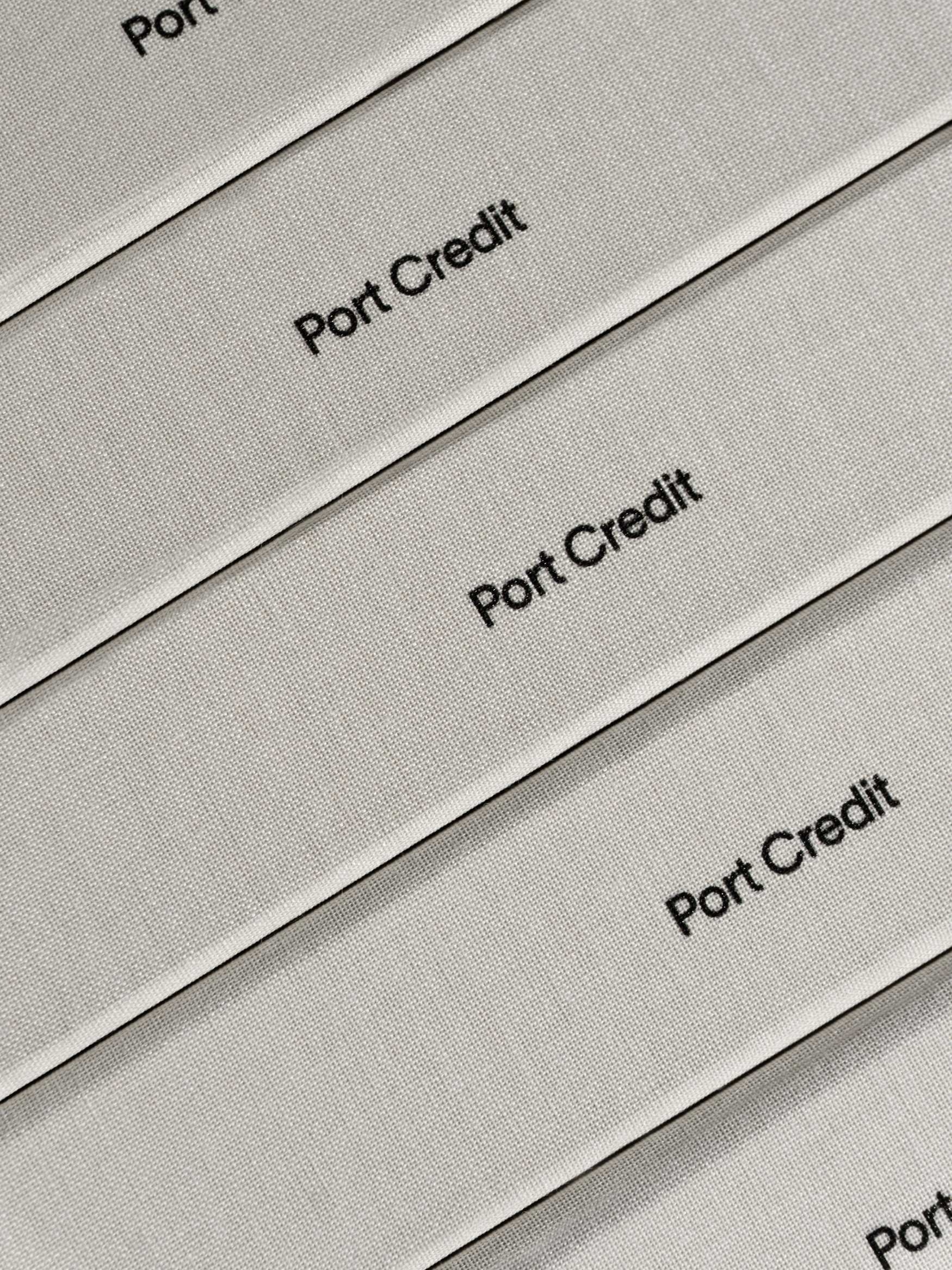
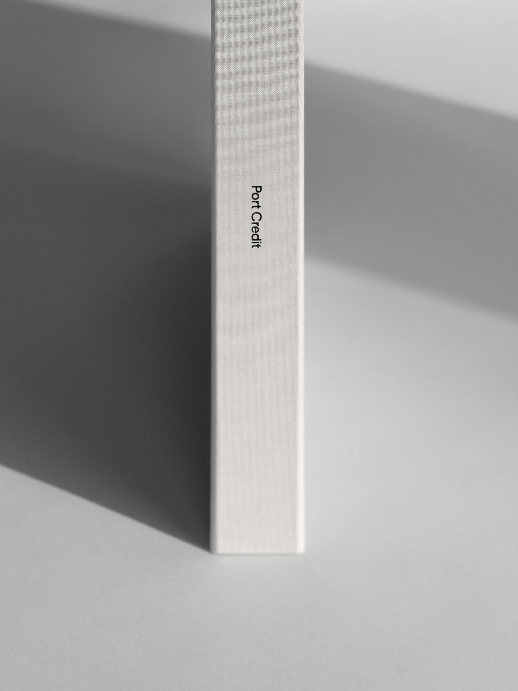
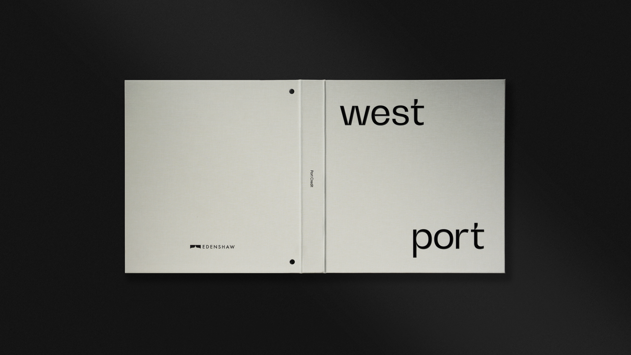
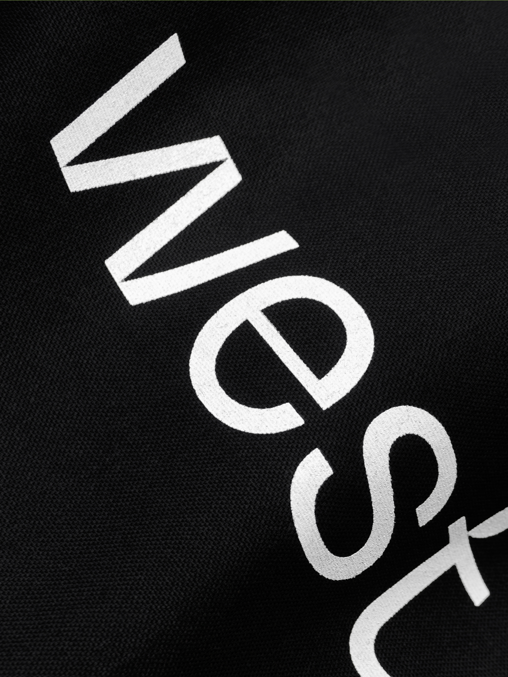
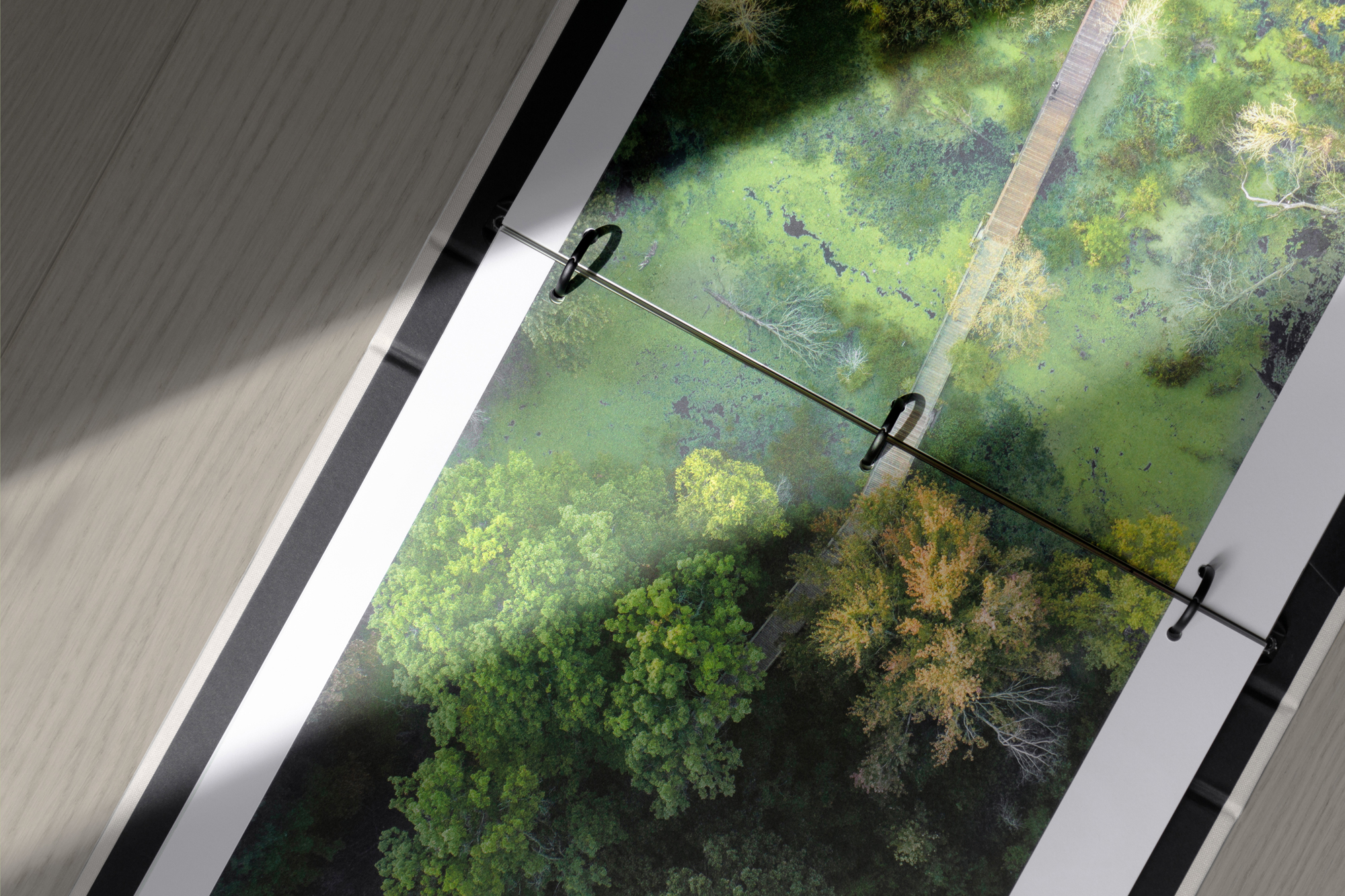
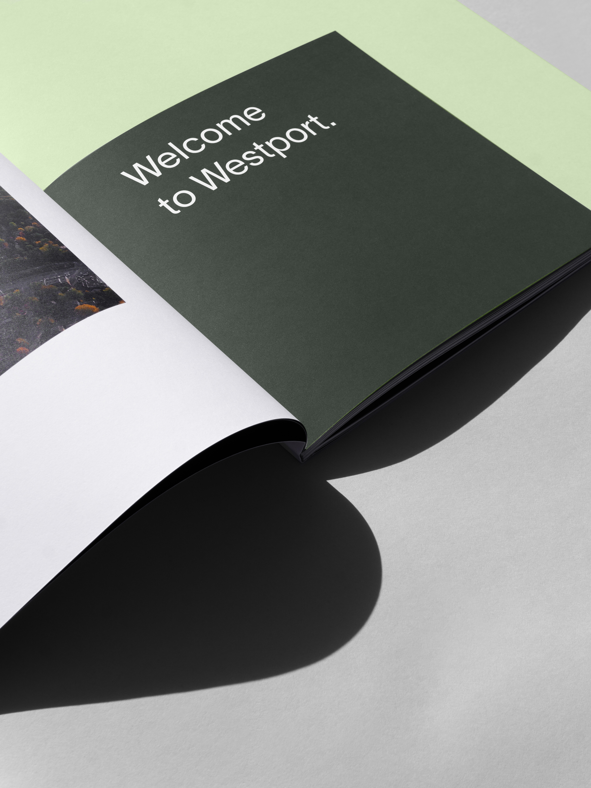
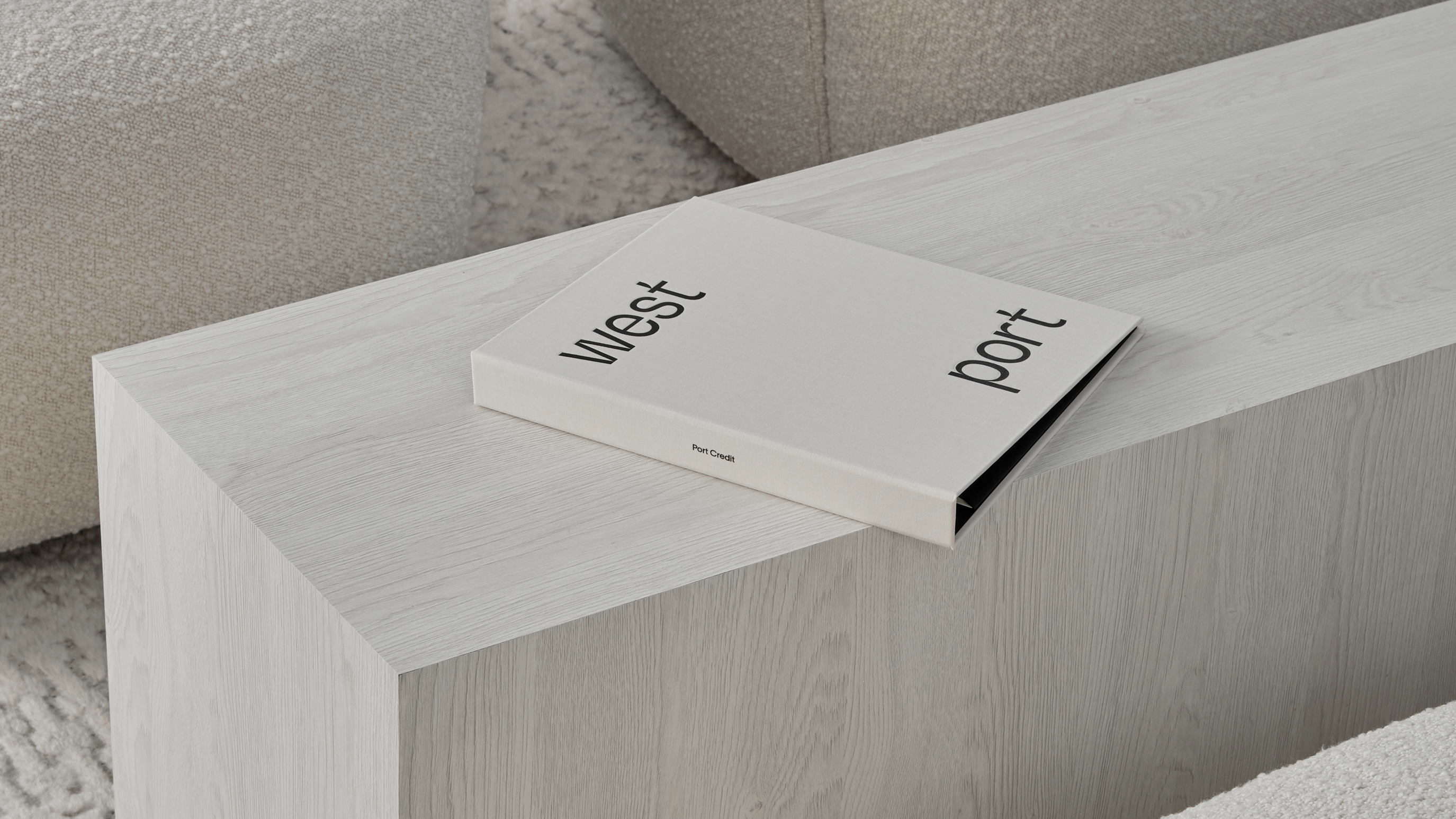
The print experience was thoughtfully designed to reflect Edenshaw’s vision for sustainability and purpose. A custom, oversized canvas-wrapped binder with an elegant deboss of the Westport logo creates a tactile experience. Inside, functional matte black hardware provides a sense of utility and function. A dynamic editorial rhythm is established throughout the brochure, embracing the duality of Westport. Contrasting textures are used throughout, juxtaposing the contemporary with the natural. Large scale imagery is used throughout to not only showcase the design-forward suites, but the openness of Port Credit itself.
The print experience was thoughtfully designed to reflect Edenshaw’s vision for sustainability and purpose. A custom, oversized canvas-wrapped binder with an elegant deboss of the Westport logo creates a tactile experience. Inside, functional matte black hardware provides a sense of utility and function. A dynamic editorial rhythm is established throughout the brochure, embracing the duality of Westport. Contrasting textures are used throughout, juxtaposing the contemporary with the natural. Large scale imagery is used throughout to not only showcase the design-forward suites, but the openness of Port Credit itself.
The print experience was thoughtfully designed to reflect Edenshaw’s vision for sustainability and purpose. A custom, oversized canvas-wrapped binder with an elegant deboss of the Westport logo creates a tactile experience. Inside, functional matte black hardware provides a sense of utility and function. A dynamic editorial rhythm is established throughout the brochure, embracing the duality of Westport. Contrasting textures are used throughout, juxtaposing the contemporary with the natural. Large scale imagery is used throughout to not only showcase the design-forward suites, but the openness of Port Credit itself.
The print experience was thoughtfully designed to reflect Edenshaw’s vision for sustainability and purpose. A custom, oversized canvas-wrapped binder with an elegant deboss of the Westport logo creates a tactile experience. Inside, functional matte black hardware provides a sense of utility and function. A dynamic editorial rhythm is established throughout the brochure, embracing the duality of Westport. Contrasting textures are used throughout, juxtaposing the contemporary with the natural. Large scale imagery is used throughout to not only showcase the design-forward suites, but the openness of Port Credit itself.
The print experience was thoughtfully designed to reflect Edenshaw’s vision for sustainability and purpose. A custom, oversized canvas-wrapped binder with an elegant deboss of the Westport logo creates a tactile experience. Inside, functional matte black hardware provides a sense of utility and function. A dynamic editorial rhythm is established throughout the brochure, embracing the duality of Westport. Contrasting textures are used throughout, juxtaposing the contemporary with the natural. Large scale imagery is used throughout to not only showcase the design-forward suites, but the openness of Port Credit itself.
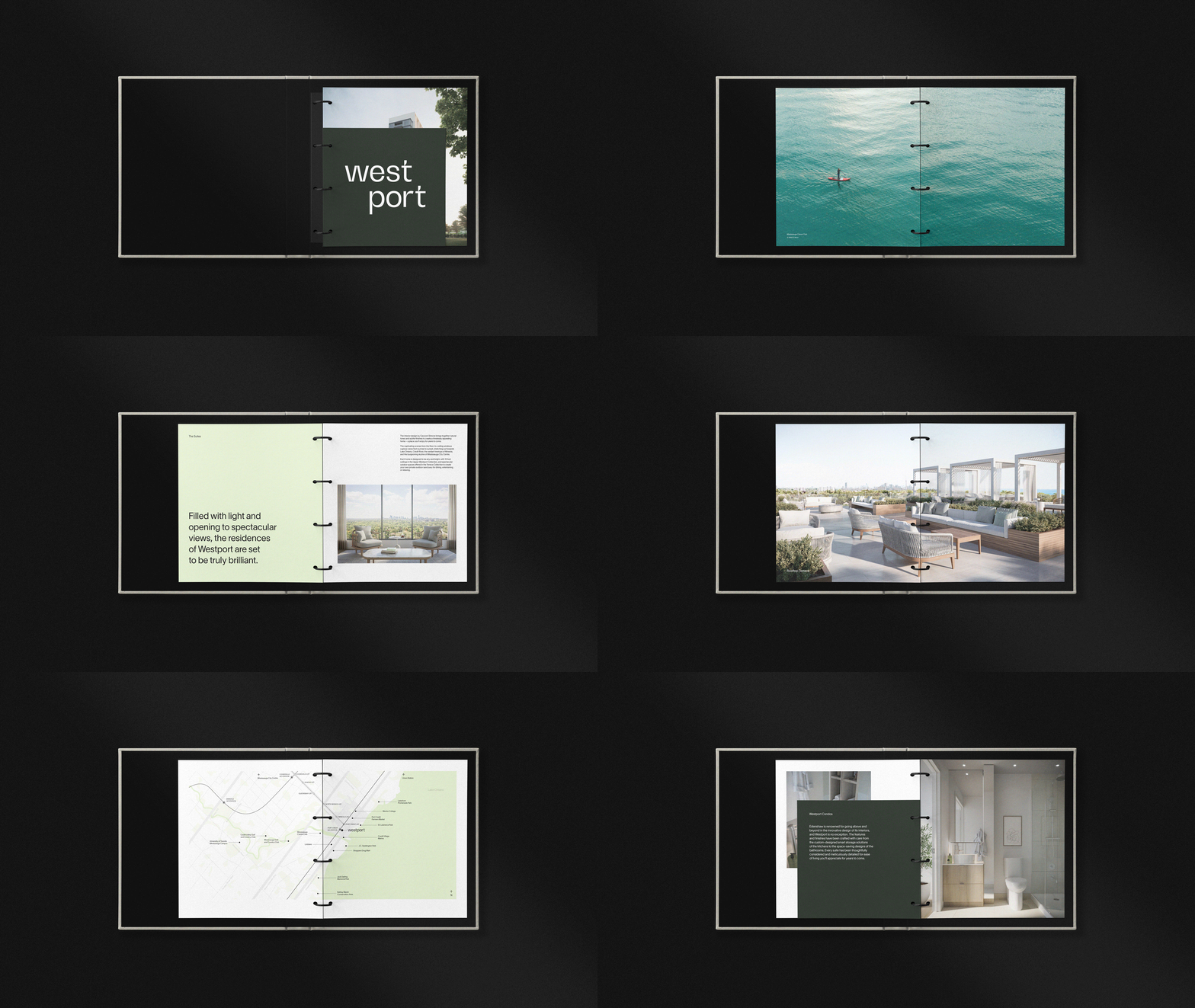
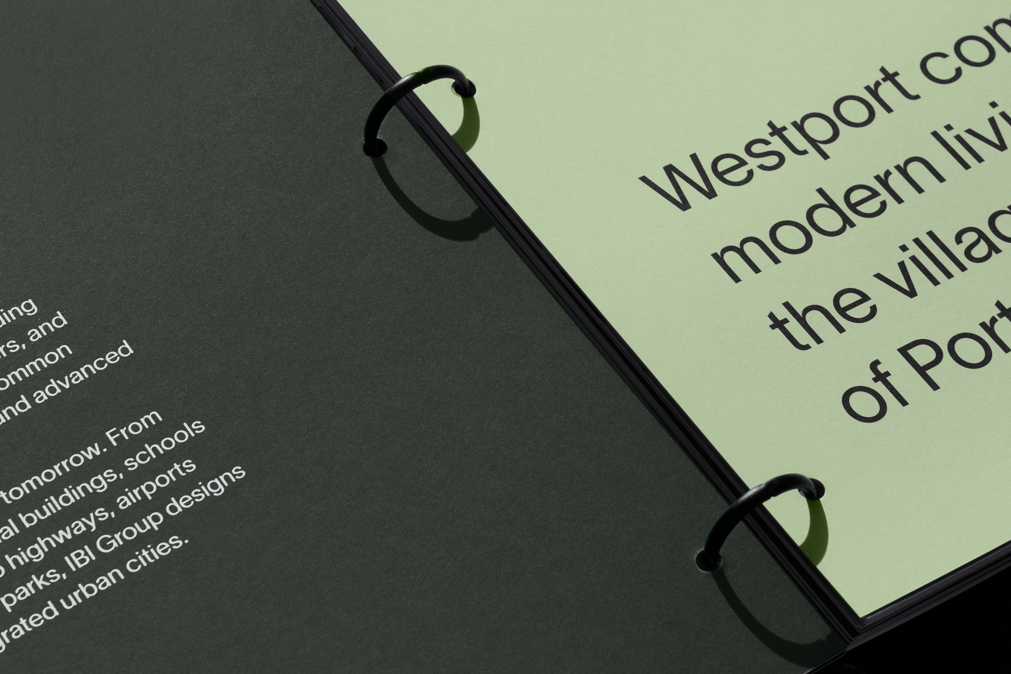
The brand’s palette consciously balances the vibrancy of transit with the tranquility of nature. A pistachio green breathes life into a scheme grounded by a muted deep green. The colours work harmoniously to frame a collection of aerial photographs featuring the vast expanse of natural amenities that surround the project site.
The brand’s palette consciously balances the vibrancy of transit with the tranquility of nature. A pistachio green breathes life into a scheme grounded by a muted deep green. The colours work harmoniously to frame a collection of aerial photographs featuring the vast expanse of natural amenities that surround the project site.
The brand’s palette consciously balances the vibrancy of transit with the tranquility of nature. A pistachio green breathes life into a scheme grounded by a muted deep green. The colours work harmoniously to frame a collection of aerial photographs featuring the vast expanse of natural amenities that surround the project site.
The brand’s palette consciously balances the vibrancy of transit with the tranquility of nature. A pistachio green breathes life into a scheme grounded by a muted deep green. The colours work harmoniously to frame a collection of aerial photographs featuring the vast expanse of natural amenities that surround the project site.
The brand’s palette consciously balances the vibrancy of transit with the tranquility of nature. A pistachio green breathes life into a scheme grounded by a muted deep green. The colours work harmoniously to frame a collection of aerial photographs featuring the vast expanse of natural amenities that surround the project site.
Every aspect of the brand was considered across all touchpoints, allowing for a cohesive and clear campaign. A curated selection of dynamic aerial photography, video sequences, and engaging key messaging delivered captivating content through all applications.
Every aspect of the brand was considered across all touchpoints, allowing for a cohesive and clear campaign. A curated selection of dynamic aerial photography, video sequences, and engaging key messaging delivered captivating content through all applications.
Every aspect of the brand was considered across all touchpoints, allowing for a cohesive and clear campaign. A curated selection of dynamic aerial photography, video sequences, and engaging key messaging delivered captivating content through all applications.
Every aspect of the brand was considered across all touchpoints, allowing for a cohesive and clear campaign. A curated selection of dynamic aerial photography, video sequences, and engaging key messaging delivered captivating content through all applications.
Every aspect of the brand was considered across all touchpoints, allowing for a cohesive and clear campaign. A curated selection of dynamic aerial photography, video sequences, and engaging key messaging delivered captivating content through all applications.
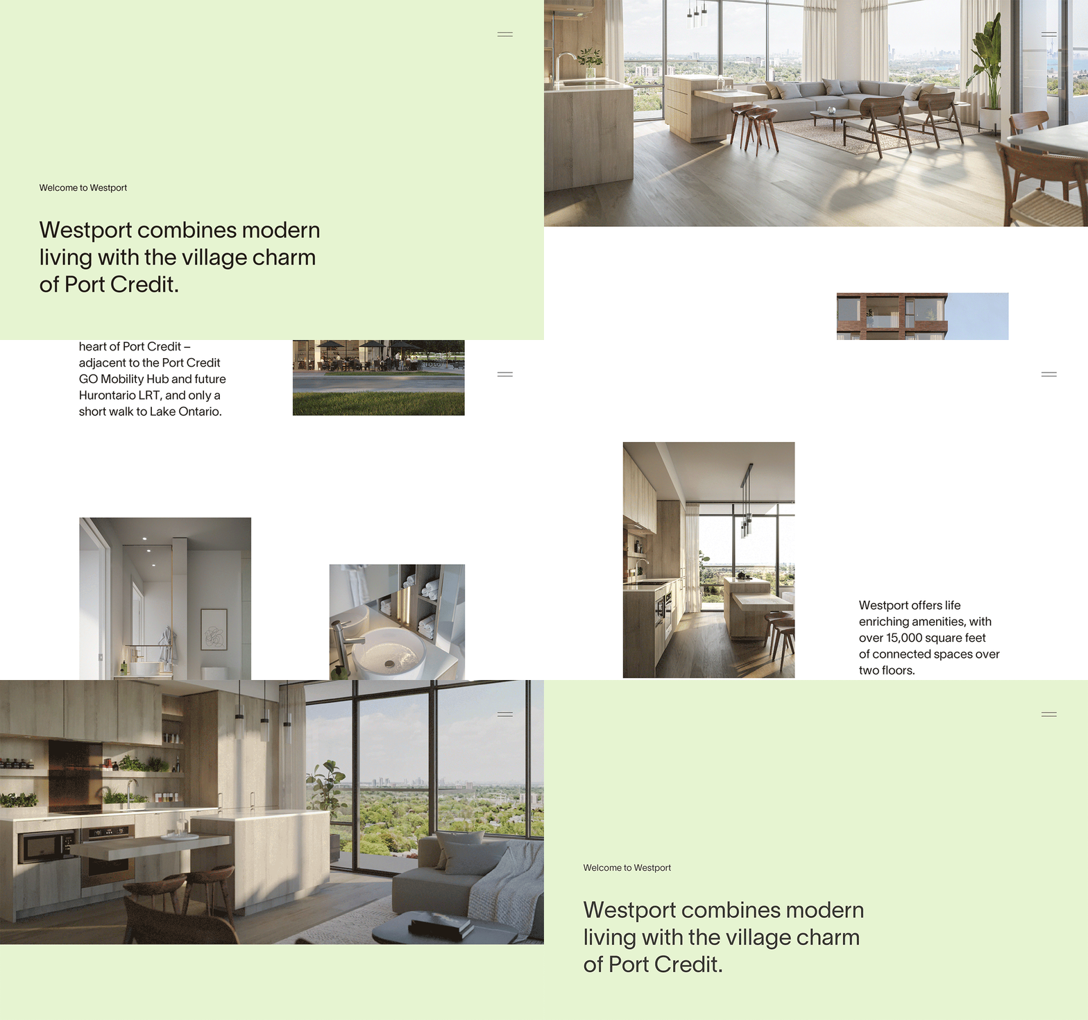
The website was designed as a digital elevation of the printed experience. With the addition of captivating videography and dynamic transitions, the Westport website captured and communicated all that the residence and surrounding neighbourhood has to offer in an intuitive and accessible format. The addition of a fully-integrated custom illustrative map offered users the flexibility of exploring the neighbourhood virtually by toggling between key categories including transit, shopping, or dining.
The website was designed as a digital elevation of the printed experience. With the addition of captivating videography and dynamic transitions, the Westport website captured and communicated all that the residence and surrounding neighbourhood has to offer in an intuitive and accessible format. The addition of a fully-integrated custom illustrative map offered users the flexibility of exploring the neighbourhood virtually by toggling between key categories including transit, shopping, or dining.
The website was designed as a digital elevation of the printed experience. With the addition of captivating videography and dynamic transitions, the Westport website captured and communicated all that the residence and surrounding neighbourhood has to offer in an intuitive and accessible format. The addition of a fully-integrated custom illustrative map offered users the flexibility of exploring the neighbourhood virtually by toggling between key categories including transit, shopping, or dining.
The website was designed as a digital elevation of the printed experience. With the addition of captivating videography and dynamic transitions, the Westport website captured and communicated all that the residence and surrounding neighbourhood has to offer in an intuitive and accessible format. The addition of a fully-integrated custom illustrative map offered users the flexibility of exploring the neighbourhood virtually by toggling between key categories including transit, shopping, or dining.
The website was designed as a digital elevation of the printed experience. With the addition of captivating videography and dynamic transitions, the Westport website captured and communicated all that the residence and surrounding neighbourhood has to offer in an intuitive and accessible format. The addition of a fully-integrated custom illustrative map offered users the flexibility of exploring the neighbourhood virtually by toggling between key categories including transit, shopping, or dining.
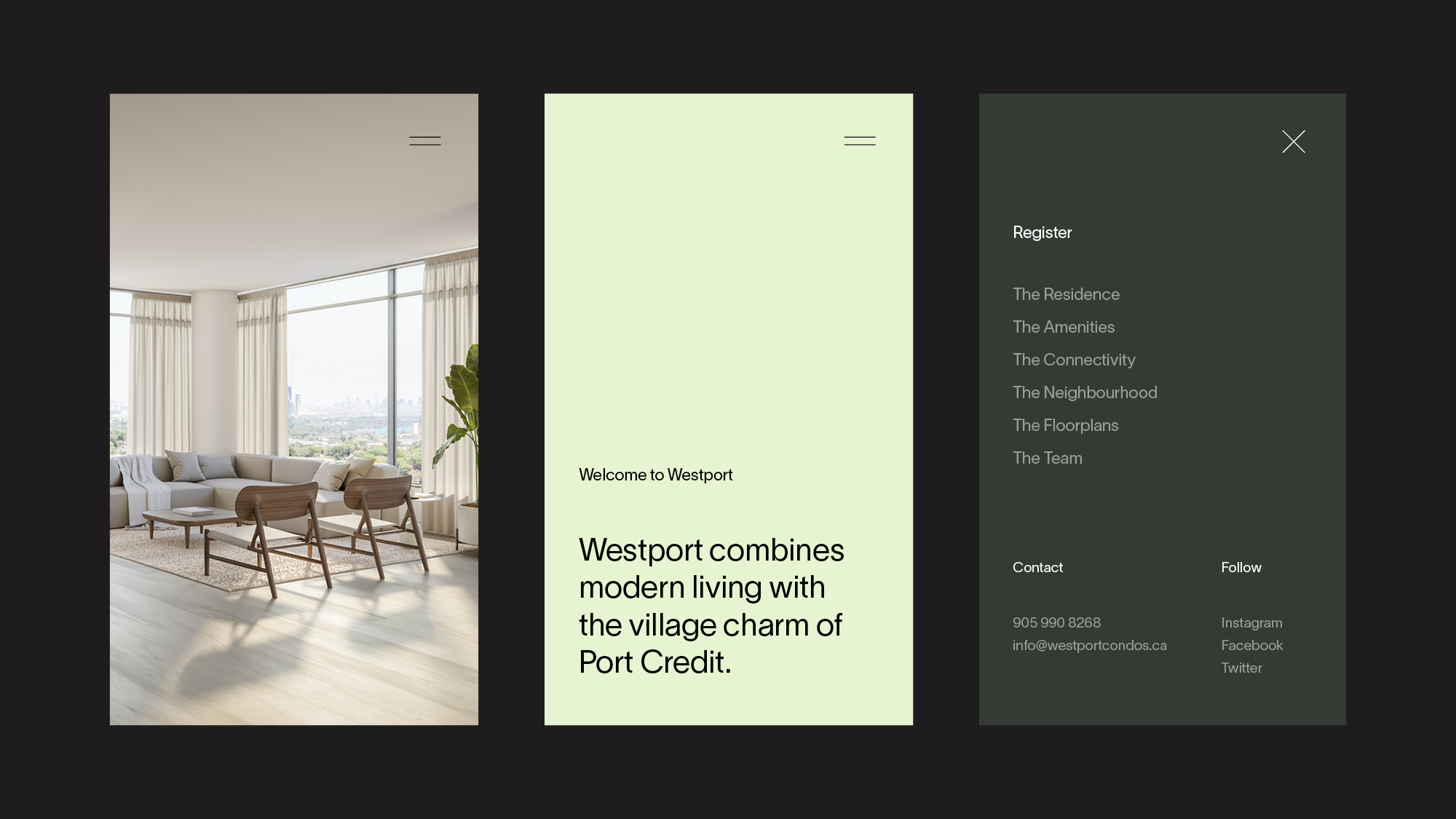
Your next move was established as the tagline for Westport. With nods to transit and the act of moving itself, this short aspirational phrase invites action and looks towards an exciting future.
Vanderbrand curated a campaign targeted specifically to investors. Building off of the familiarity of the key language, your next investment was introduced. A series of assets were created, including videos featuring key facts paired with illustrated graphics. This allowed for the communication of key information outlining the benefits of investing in Westport, and in Port Credit. In each video within the series, Vanderbrand told a story that resonated with the targeted purchaser and fostered an emotional connection with the product and its landscape.

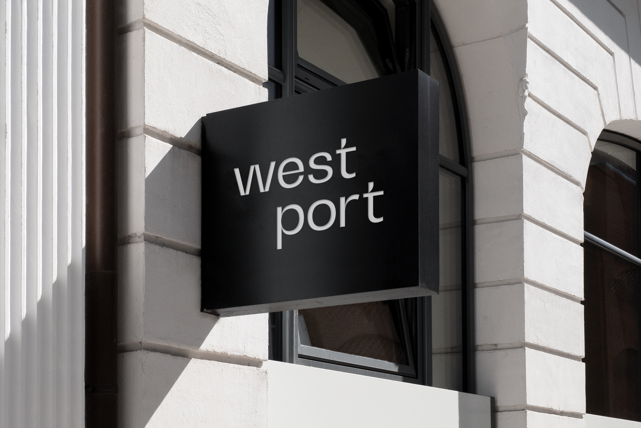
The sales centre was approached as a gallery, showcasing Westport and the surrounding area. A matte black medallion sign was installed above the entrance, a permanent fixture that enhanced the visitor experience.
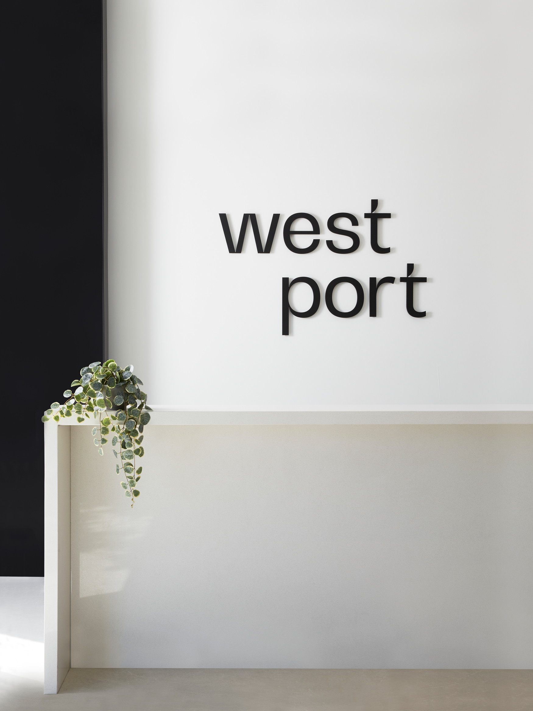
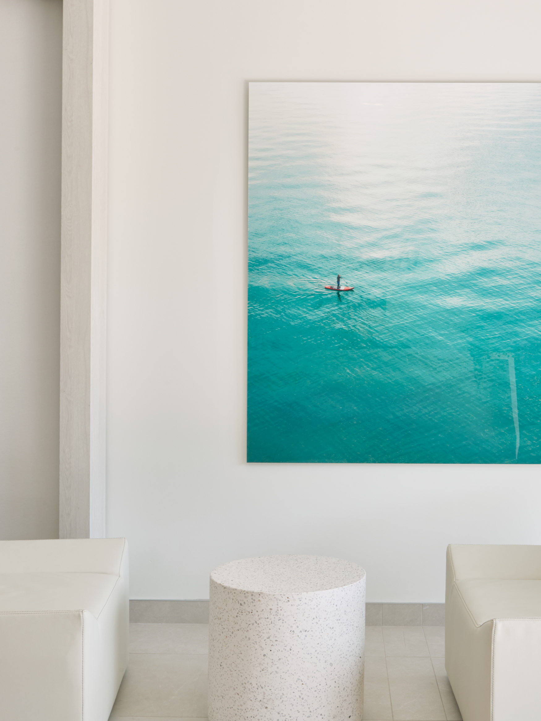
Inside, the sales gallery reflects the curated living spaces that sit comfortably within the landscape of Port Credit, while also highlighting the elevated finishings that Edenshaw is known for. Pared-back interior marketing introduces Westport, while allowing for the use of interactive marketing tools such as a fully-integrated custom touch-screen area map.
Awards
2021 Applied Arts Design Awards
Award Recipient
Brochure/Catalogue
2021 Communication Arts Design Competition
Shortlist
Brochure
More Work
A new district, a growing city, a brilliant future
A new district, a growing city, a brilliant future
A new district, a growing city, a brilliant future
A flexible treatment for size-inclusive activewear
A flexible treatment for size-inclusive activewear
A flexible treatment for size-inclusive activewear

