Sapsucker
Sapsucker
Sapsucker
Client
Lower Valley Beverage Company
Discipline
Retail
Location
Toronto, Ontario
Sapsucker is an organic, plant-based, all-natural, and sustainably sourced tree water with no added sugar.
A departure from the regular, Sapsucker is tapped from Canadian trees through environmentally friendly processes to harvest a naturally alkaline and vitamin-rich sparkling beverage.
Vanderbrand was engaged by Lower Valley Beverage Company (LVBC) to rebrand and reposition Sapsucker within the growing sparkling water market. This required a brand strategy and identity to position the beverage for global brand recognition.
Vanderbrand worked closely with LVBC to create an unexpected Canadian product from every angle; a holistic brand with a clear and consistent approach across the brand identity, product naming, packaging, copywriting, digital applications, social media, and art direction.


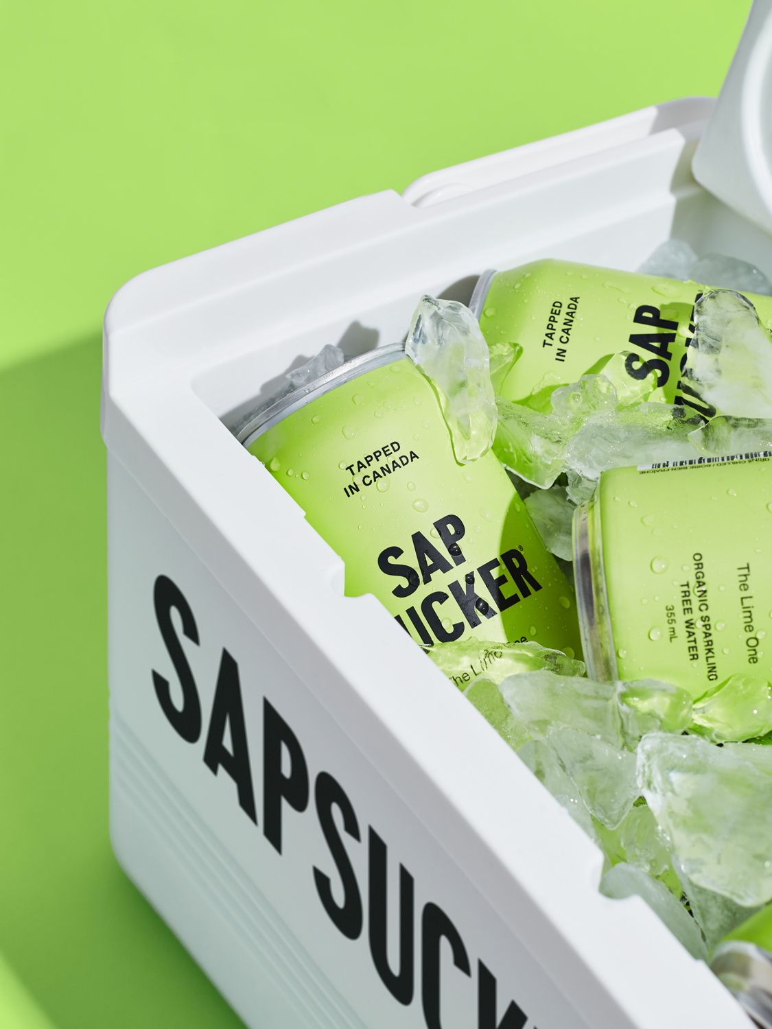
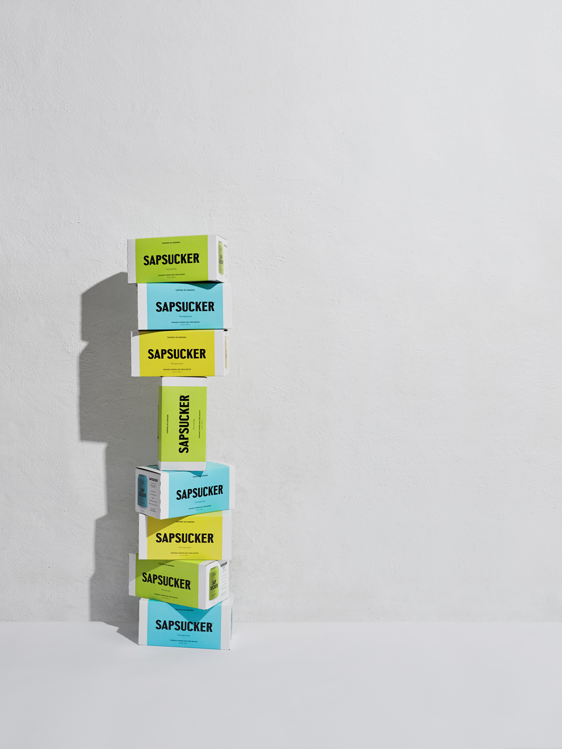
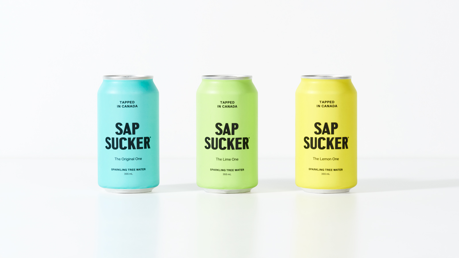
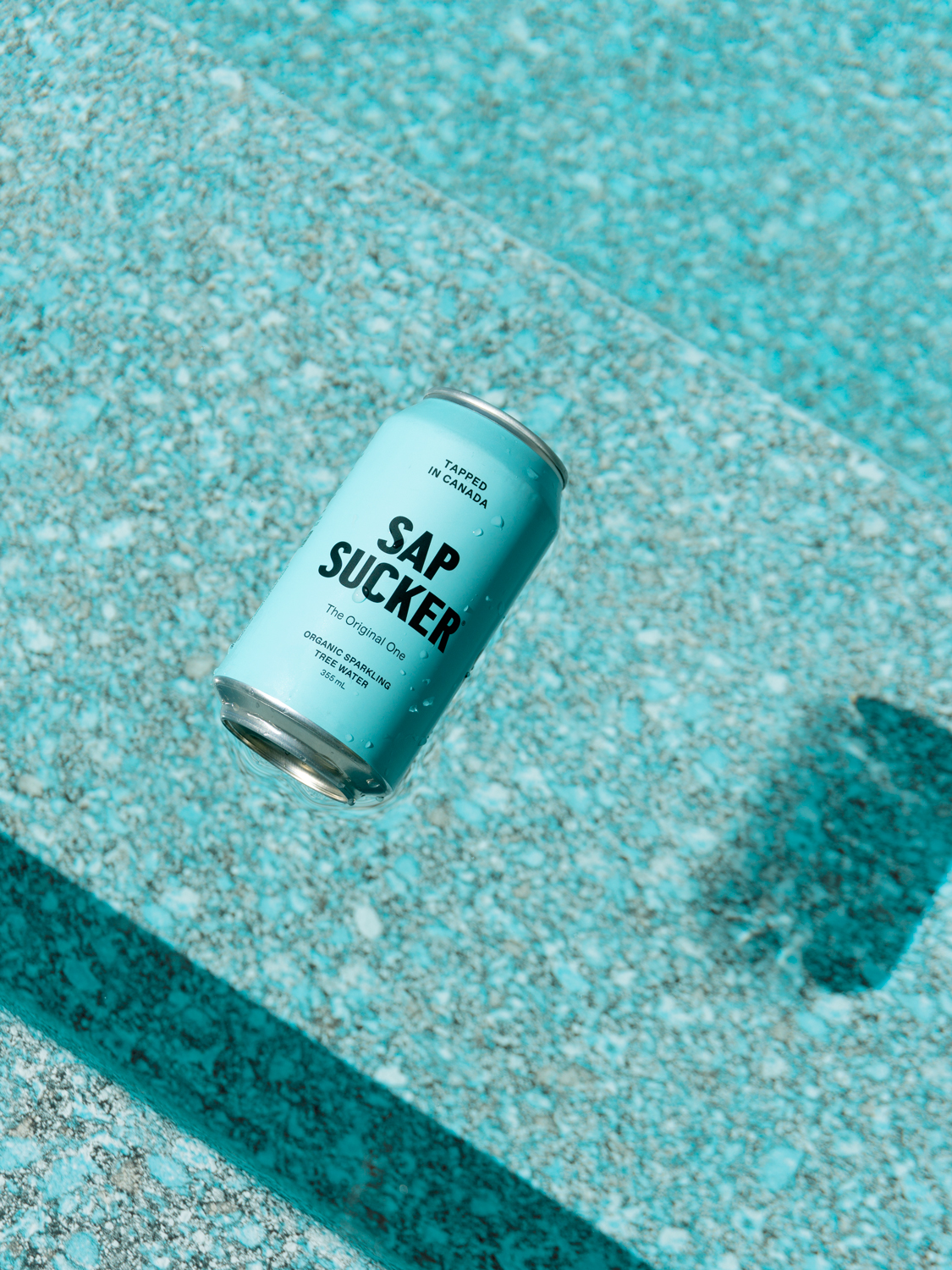
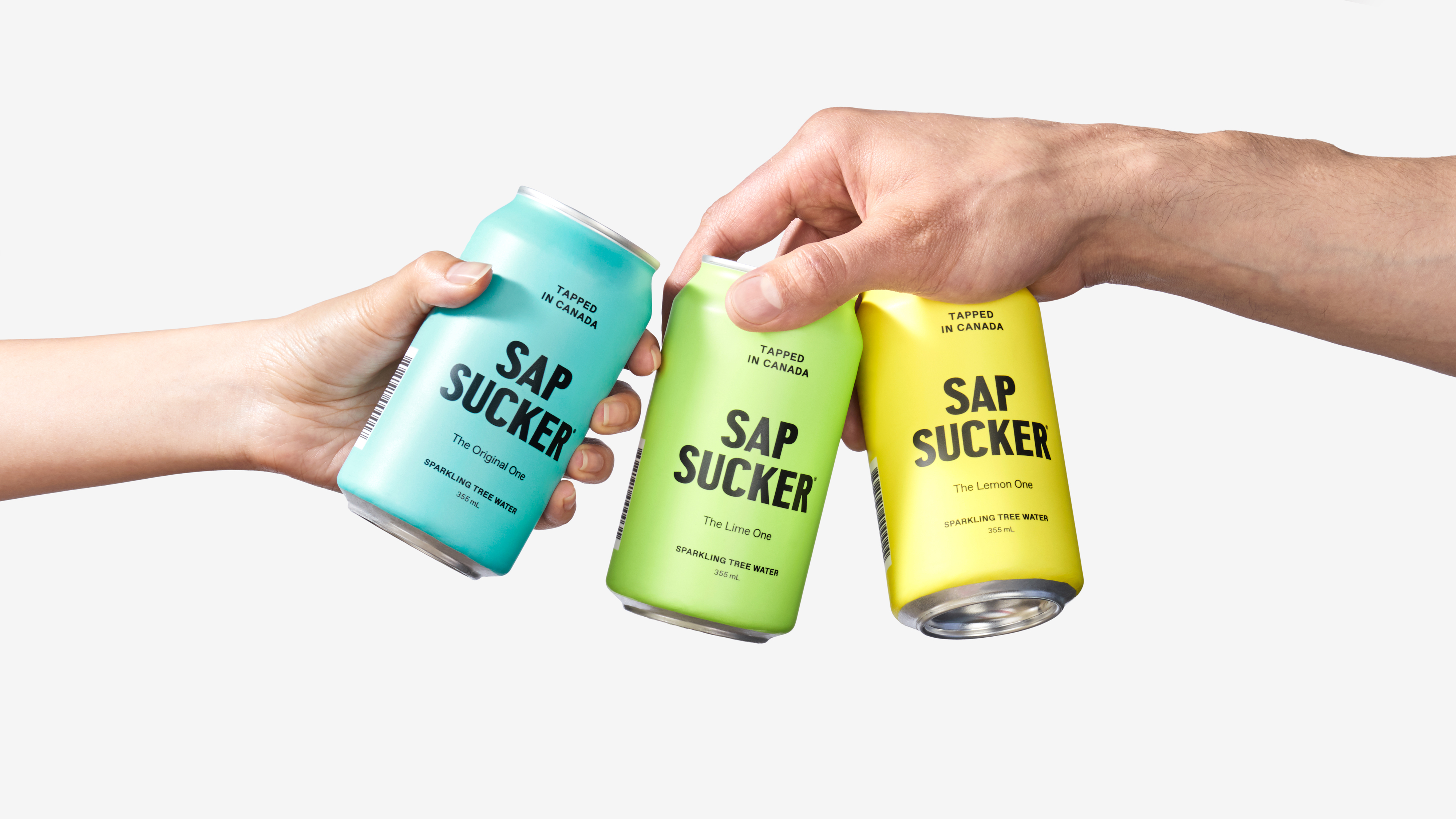
Sapsucker had originally entered the wellness beverage market as a flat maple tree water, and is now being reinvented with a new lineup of three lightly carbonated tree water beverages: The Original One, The Lime One, and The Lemon One.
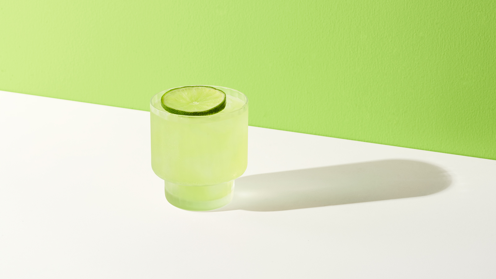
Sapsucker is a naturally hydrating beverage that advocates for people to make healthy, mindful choices. Uniquely harvested from Canadian forests, it uplifts and rejuvenates the body with a clean, crisp taste.
Sapsucker had originally entered the wellness beverage market as a flat maple tree water, and is now being reinvented with a new lineup of three lightly carbonated tree water beverages: The Original One, The Lime One, and The Lemon One.
Sapsucker is a naturally hydrating beverage that advocates for people to make healthy, mindful choices. Uniquely harvested from Canadian forests, it uplifts and rejuvenates the body with a clean, crisp taste.
Sapsucker originally entered the wellness beverage market as a flat maple tree water, but Sapsucker has chosen to reinvent itself. The new lineup includes three lightly carbonated tree water beverages: The Original One, The Lime One, and the Lemon One.
Sapsucker is a naturally hydrating beverage that advocates for people to make healthy, mindful choices. Uniquely harvested from Canadian forests, it uplifts and rejuvenates the body with a clean, crisp taste.
Sapsucker had originally entered the wellness beverage market as a flat maple tree water, and is now being reinvented with a new lineup of three lightly carbonated tree water beverages: The Original One, The Lime One, and The Lemon One.
Sapsucker is a naturally hydrating beverage that advocates for people to make healthy, mindful choices. Uniquely harvested from Canadian forests, it uplifts and rejuvenates the body with a clean, crisp taste.
Vanderbrand developed and implemented a brand strategy that revolutionized Sapsucker's position in the health and wellness category. An eye-catching shelf presence, balanced with a witty tone and clever messaging, established a no-nonsense and unique visual language.
This brand positioning was intended to attract those who enjoy life and live well, which led to the creation and implementation of the trademarked tagline, Pairs Well with Life.
Vanderbrand developed and implemented a brand positioning that revolutionized Sapsucker's position in the health and wellness category by establishing a no-nonsense visual language; providing eye-catching shelf presence, balanced with a witty tone and clever messaging.
This brand positioning was intended to attract those who like to enjoy life by capitalizing on the consumer's feelings of nostalgia for adventure and good times. This feeling led to the creation and implementation of the trademarked tagline, Pairs Well with Life.
Vanderbrand developed and implemented a brand strategy that revolutionized Sapsucker's position in the health and wellness category. An eye-catching shelf presence, balanced with a witty tone and clever messaging, established a no-nonsense and unique visual language.
This brand positioning was intended to attract those who enjoy life and live well, which led to the creation and implementation of the trademarked tagline, Pairs Well with Life.
Vanderbrand developed and implemented a brand positioning that revolutionized Sapsucker's position in the health and wellness category. An eye-catching shelf presence, balanced with a witty tone and clever messaging, established a no-nonsense and unique visual language.
This brand positioning was intended to attract those who enjoy life and live well, which led to the creation and implementation of the trademarked tagline, Pairs Well with Life.
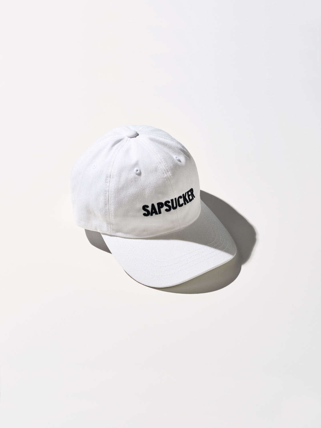
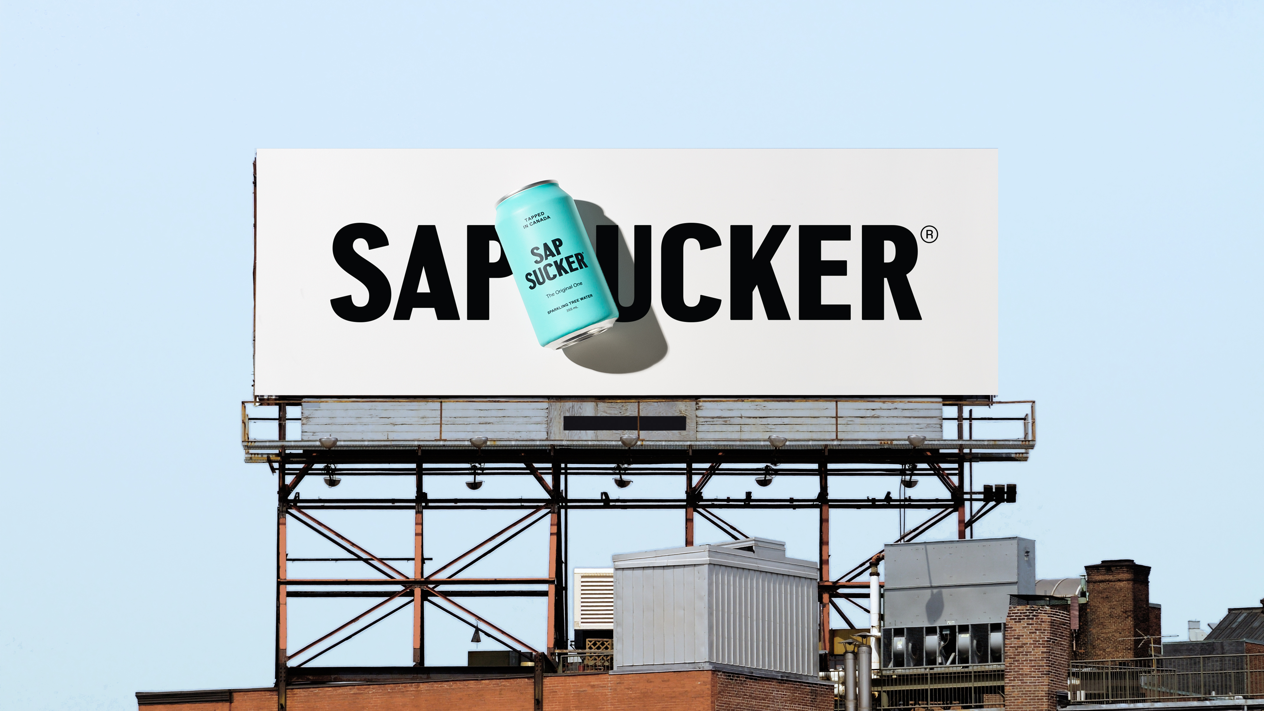
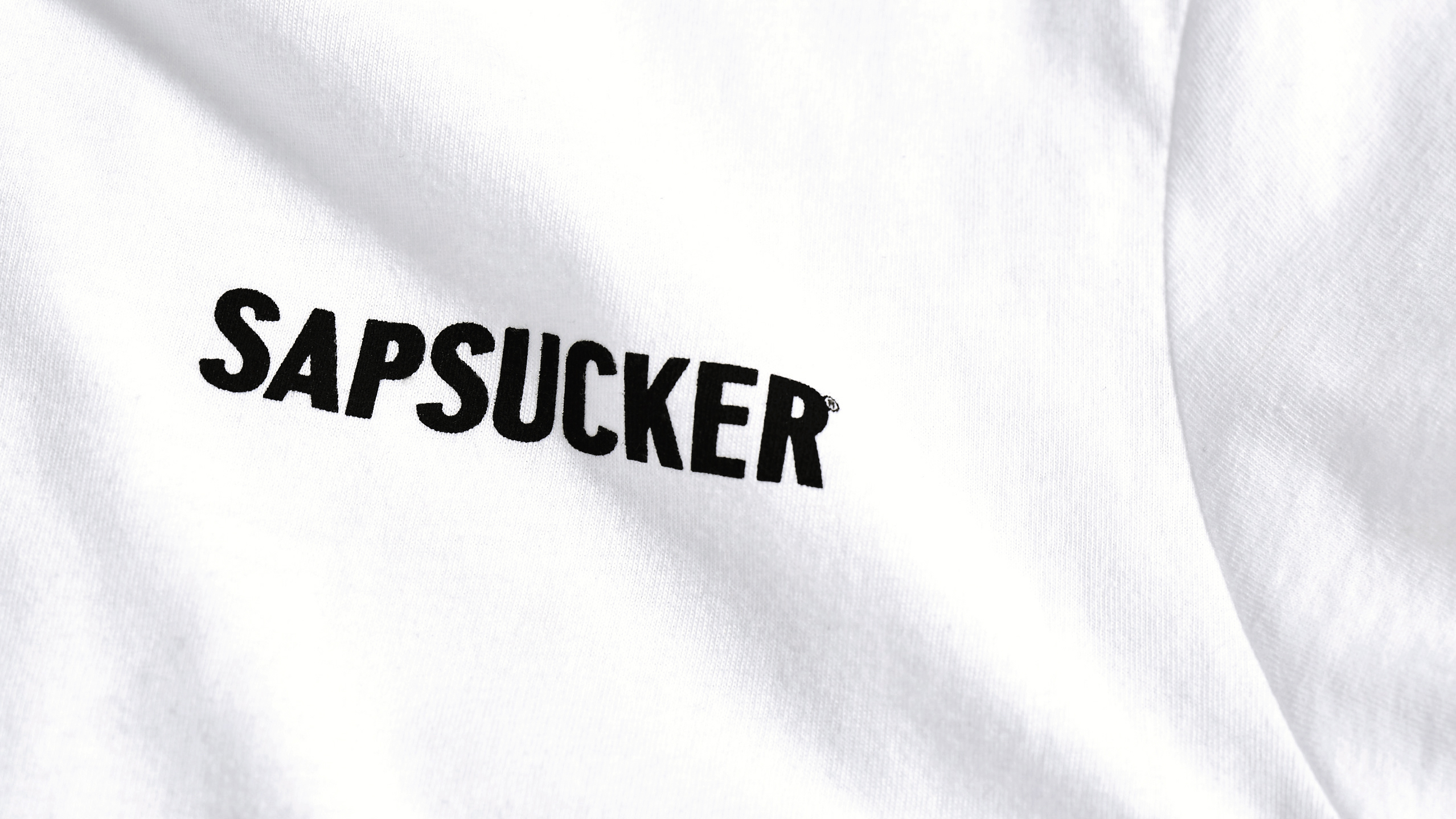
The brand identity for Sapsucker is strongly informed by its Canadian roots. The wordmark takes cues from Canadian nostalgia including local sport apparel and retail packaging.
Pairing the historically referenced typeface with a modern graphic language results in a visual system that is appropriate, distinctive, and flexible for varied scales and applications.
Vanderbrand was challenged to create a brand identity that would appeal to a diverse audience while standing out visually and thematically in an oversaturated health and wellness beverage category. The result is an identity packed with visual personality and embraces the bold characteristics of the name Sapsucker.
Vanderbrand was challenged to create a brand identity that would appeal to a diverse audience while standing out visually and thematically in an oversaturated health and wellness beverage category. The result is an identity packed with visual personality and embraces the bold characteristics of the name Sapsucker.
Vanderbrand was challenged to create a brand identity that would appeal to a diverse audience while standing out visually and thematically in an oversaturated health and wellness beverage category. The result is an identity packed with visual personality and embraces the bold characteristics of the name Sapsucker.
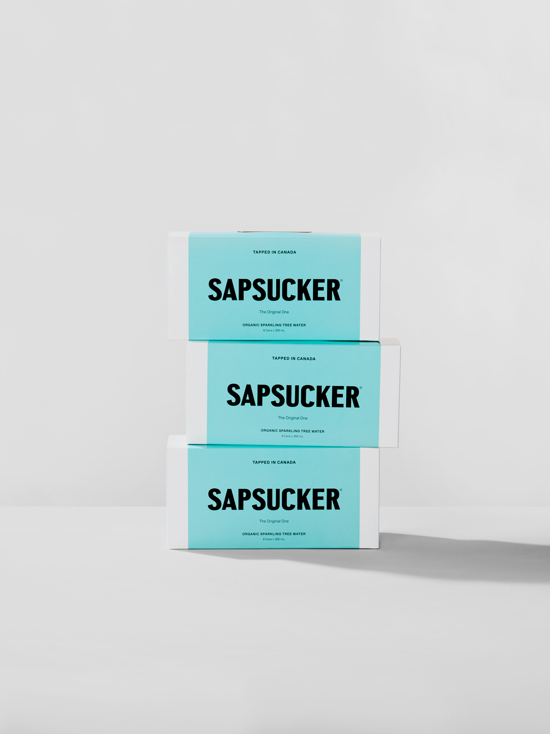
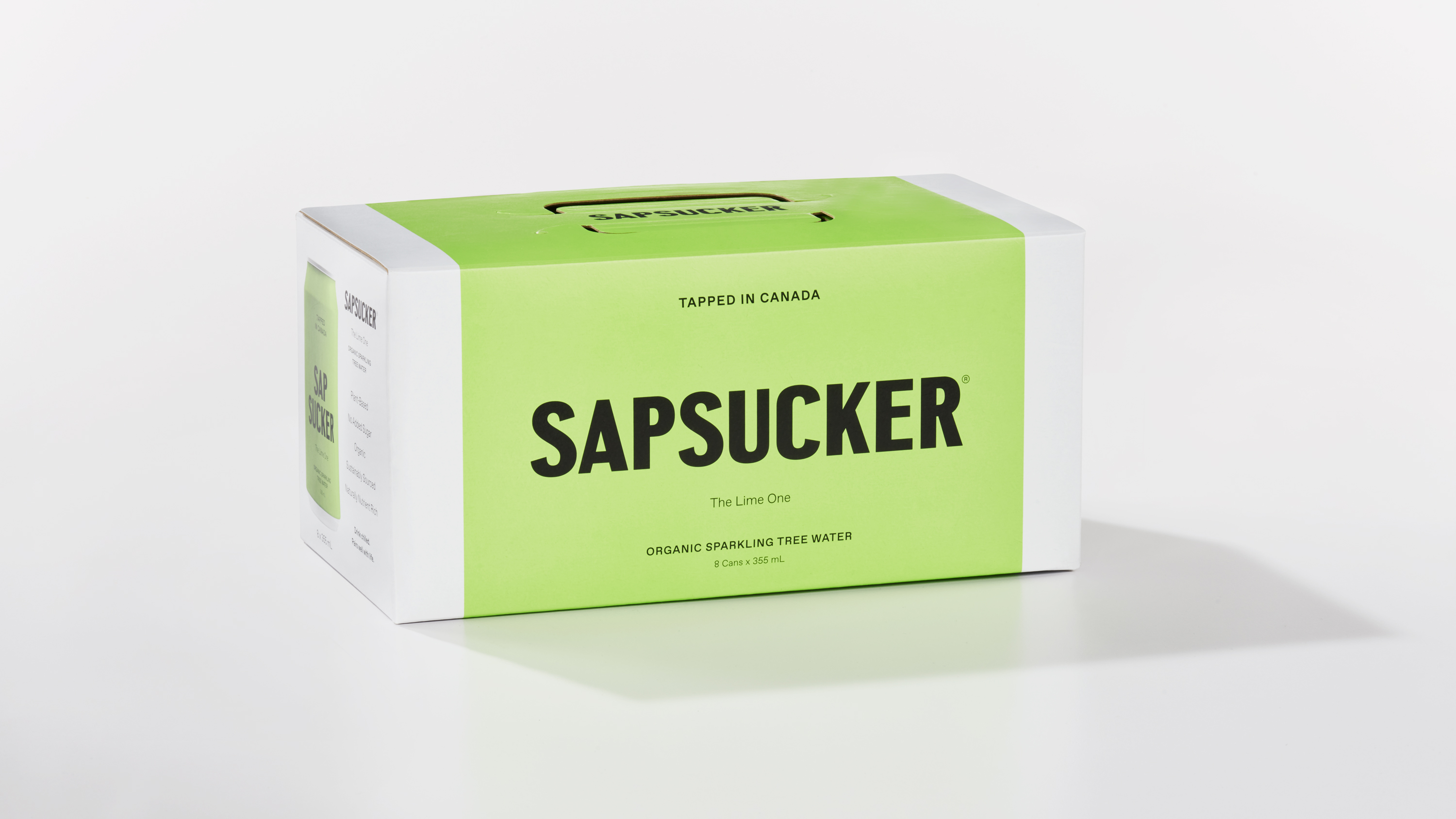
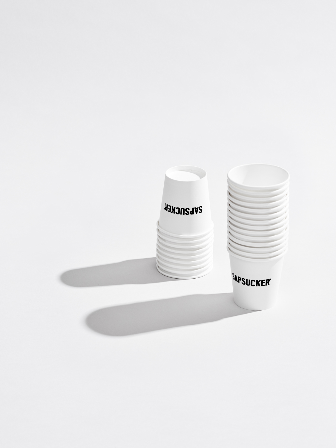
Vanderbrand designed a brand system that considers every touchpoint, including the functionality of the packaging and its shelf presence. An unboxing experience was created to highlight Sapsucker’s mandate to maintain sustainable processes for the planet, which is also a requirement for the knowledgeable and curious consumer.
In addition, a custom 8-pack foldable carrier was developed with minimal adhesive making it more recyclable than the average carrier.
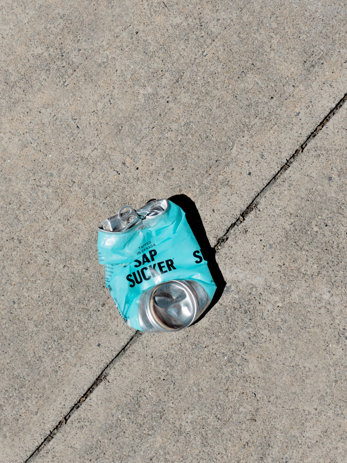
Vanderbrand strategically pivots from the typical tricks and tropes of Canadian products to allow the product to speak for itself and create a truly unique brand.
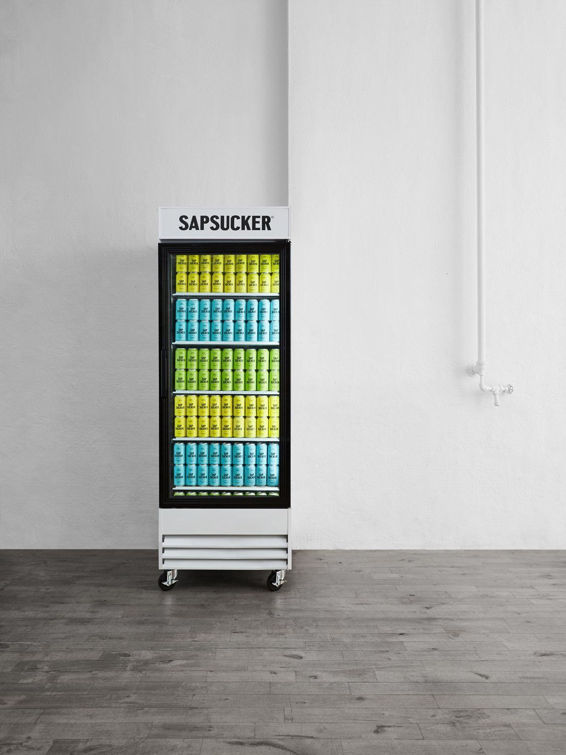
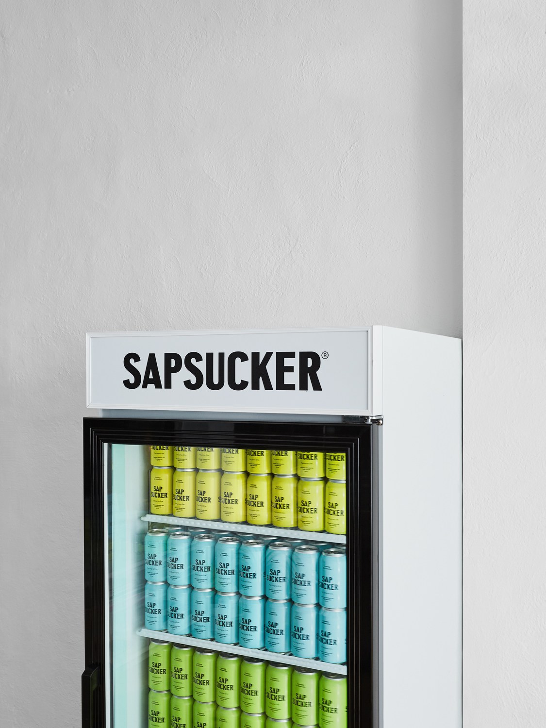
The Sapsucker brand plays upon its strong colour palette and bold typography as a key differentiator in the marketplace. The striking shelf presence cannot be missed, and is unlike any other beverage in the industry.
Vanderbrand strategically pivots from the typical tricks and tropes of Canadian products to allow the product to speak for itself. Through minimalist design — using typography alone — the Sapsucker brand plays upon its strong colour palette and uses it as their key differentiator in the marketplace. Their striking shelf presence cannot be missed, and is unlike any other beverage in the industry.
Vanderbrand strategically pivots from the typical tricks and tropes of Canadian products to allow the product to speak for itself. Through minimalist design, using typography alone, the Sapsucker brand plays upon its colour palette as their key differentiator for their striking shelf presence.
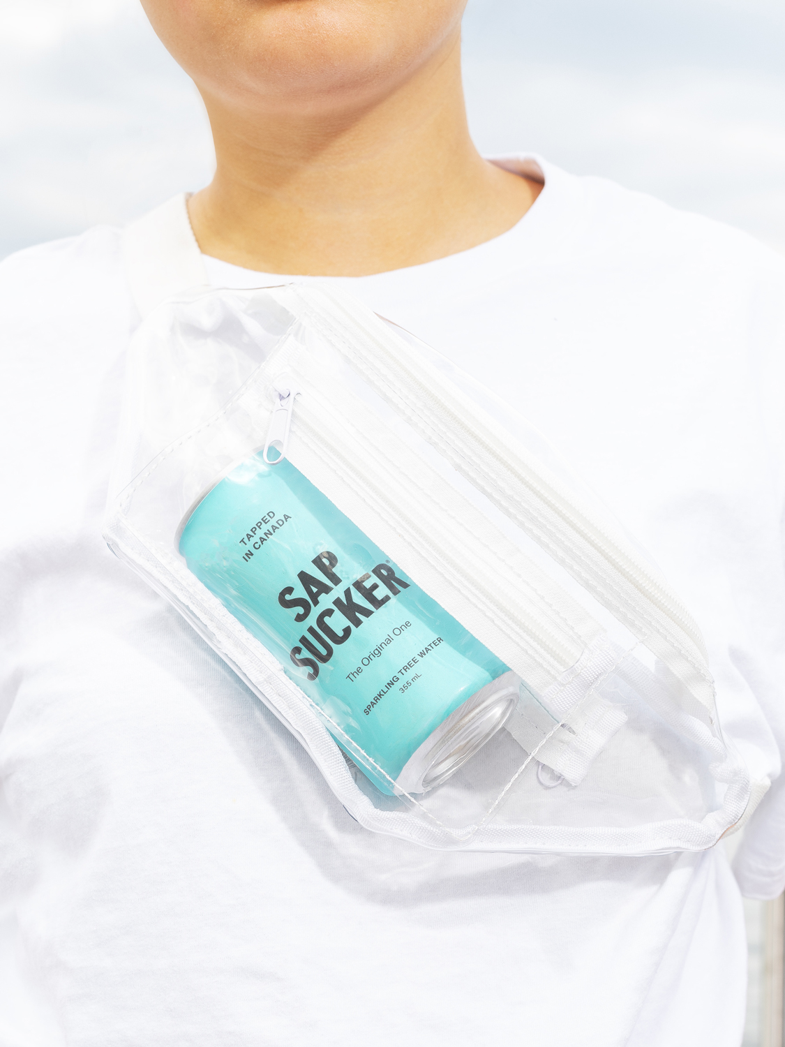
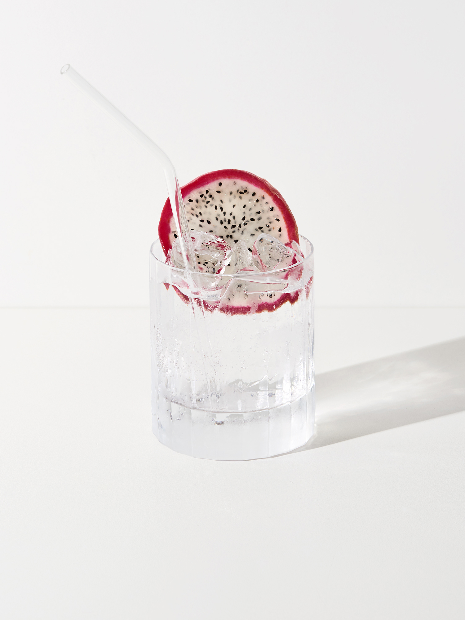
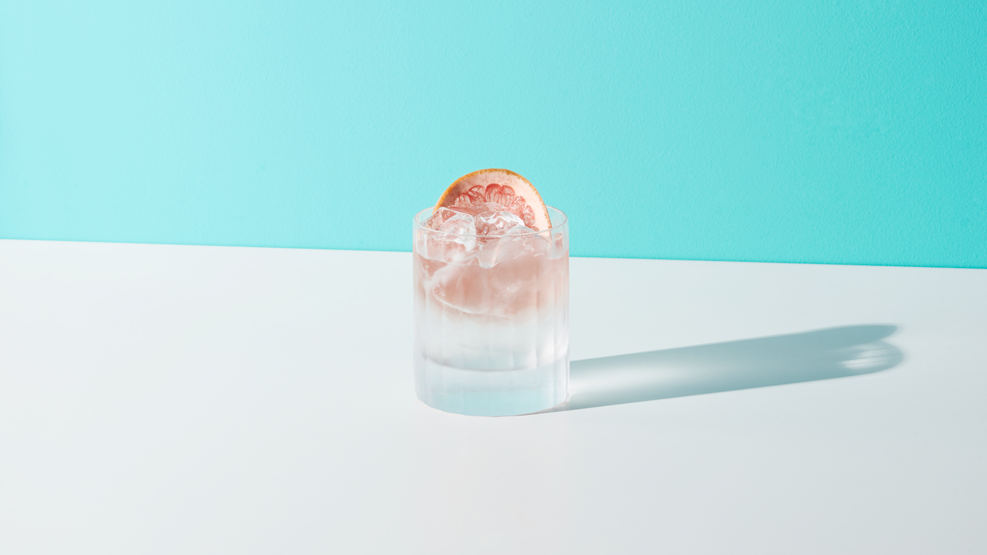
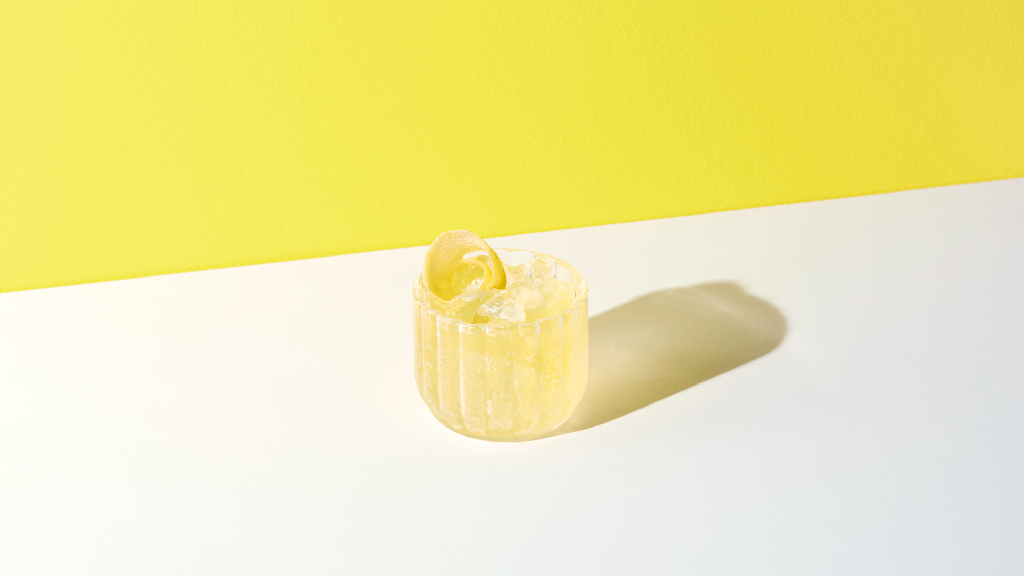
Photography and messaging are a key component of every Vanderbrand brand strategy. For Sapsucker, a distinctive platform was developed with visuals and a voice that promotes not only the benefits of the beverage but of living well.
Photography and messaging are a key component of every Vanderbrand brand strategy. For Sapsucker, a distinctive platform was developed with visuals and a voice that promotes not only the benefits of the beverage but of living well.
Photography and messaging are a key component of every Vanderbrand brand strategy. For Sapsucker, a distinctive platform was developed with visuals and a voice that promotes not only the benefits of the beverage but of living well.
Across digital and social channels, the art direction for Sapsucker photography is well curated and contemporary, based around moments of the everyday person enjoying life. These visuals are accented by messaging that is not boring or ordinary, but instead offers a refreshingly witty perspective of optimism and mindfulness.
Across digital and social channels, the art direction for Sapsucker photography is well curated and contemporary, based around moments of the everyday person enjoying life. These visuals are accented by messaging that is not boring or ordinary, but instead offers a refreshingly witty perspective of optimism and mindfulness.
Awards
2021 ADCC Awards
Bronze Award Recipient
Packaging, Single
2021 ADCC Awards
Silver Award Recipient
2021 ADCC Awards
Silver Award Recipient
Rebrand
2020 Pentawards
Silver Award Recipient
Functional Beverages
2020 Communication Arts Design Competition
Award of Excellence
Packaging, Series
2020 Communication Arts Design Competition
Shortlist
Integrated Branding Program
2020 Applied Arts Design Awards
Award Winner
Brand Identity, Logo Applications
More Work
Building a better platform to get things done
Building a better platform to get things done
Building a better platform to get things done
A new district, a growing city, a brilliant future
A new district, a growing city, a brilliant future
A new district, a growing city, a brilliant future
A flexible treatment for size-inclusive activewear
A flexible treatment for size-inclusive activewear
A flexible treatment for size-inclusive activewear