Heartland
Heartland
Heartland
Heartland
Client
Orlando Corporation
Client
Orlando Corporation
Client
Orlando Corporation
Client
Orlando Corporation
Discipline
Commercial Real Estate
Discipline
Commercial Real Estate
Location
Mississauga, Ontario
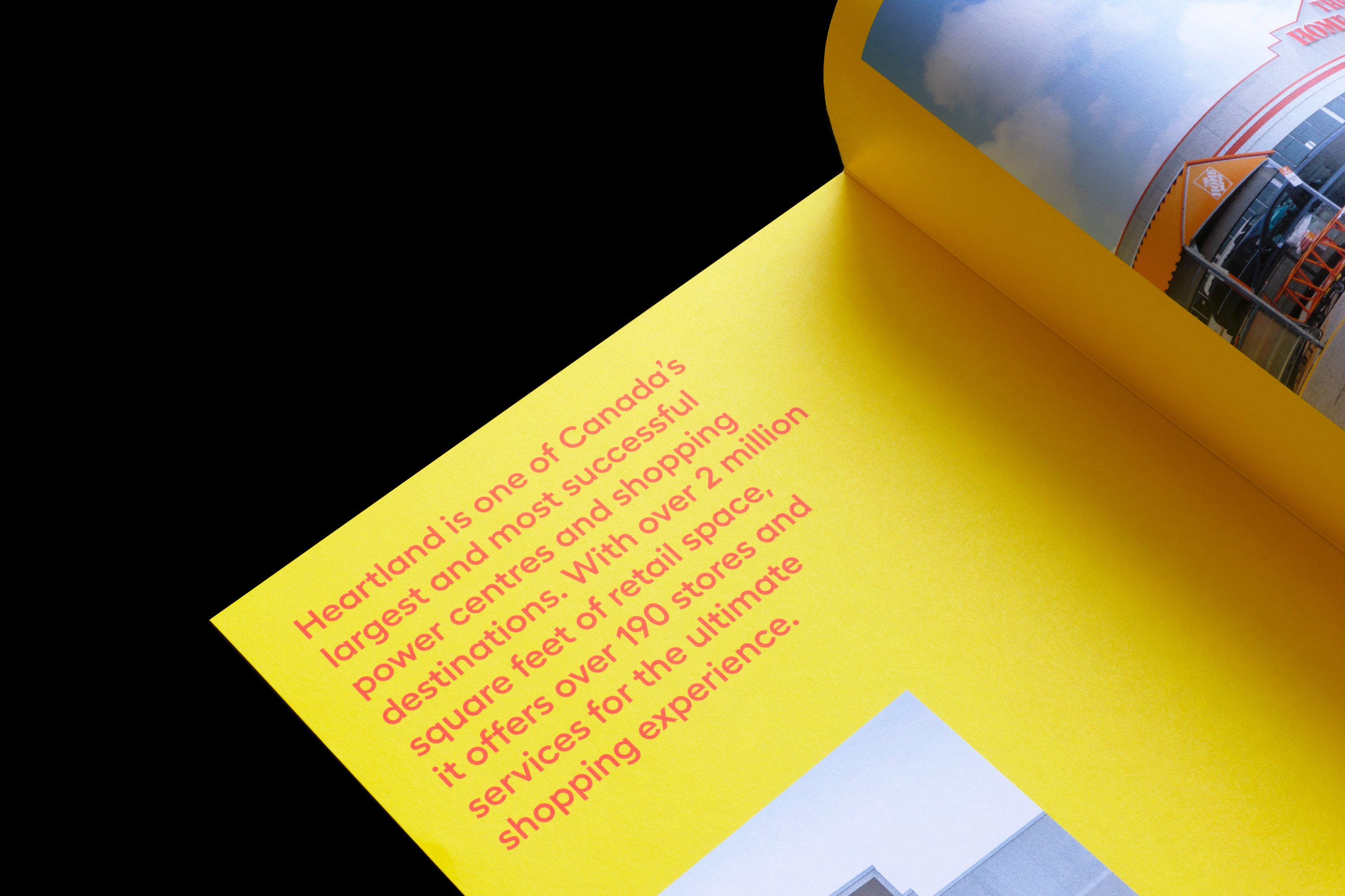
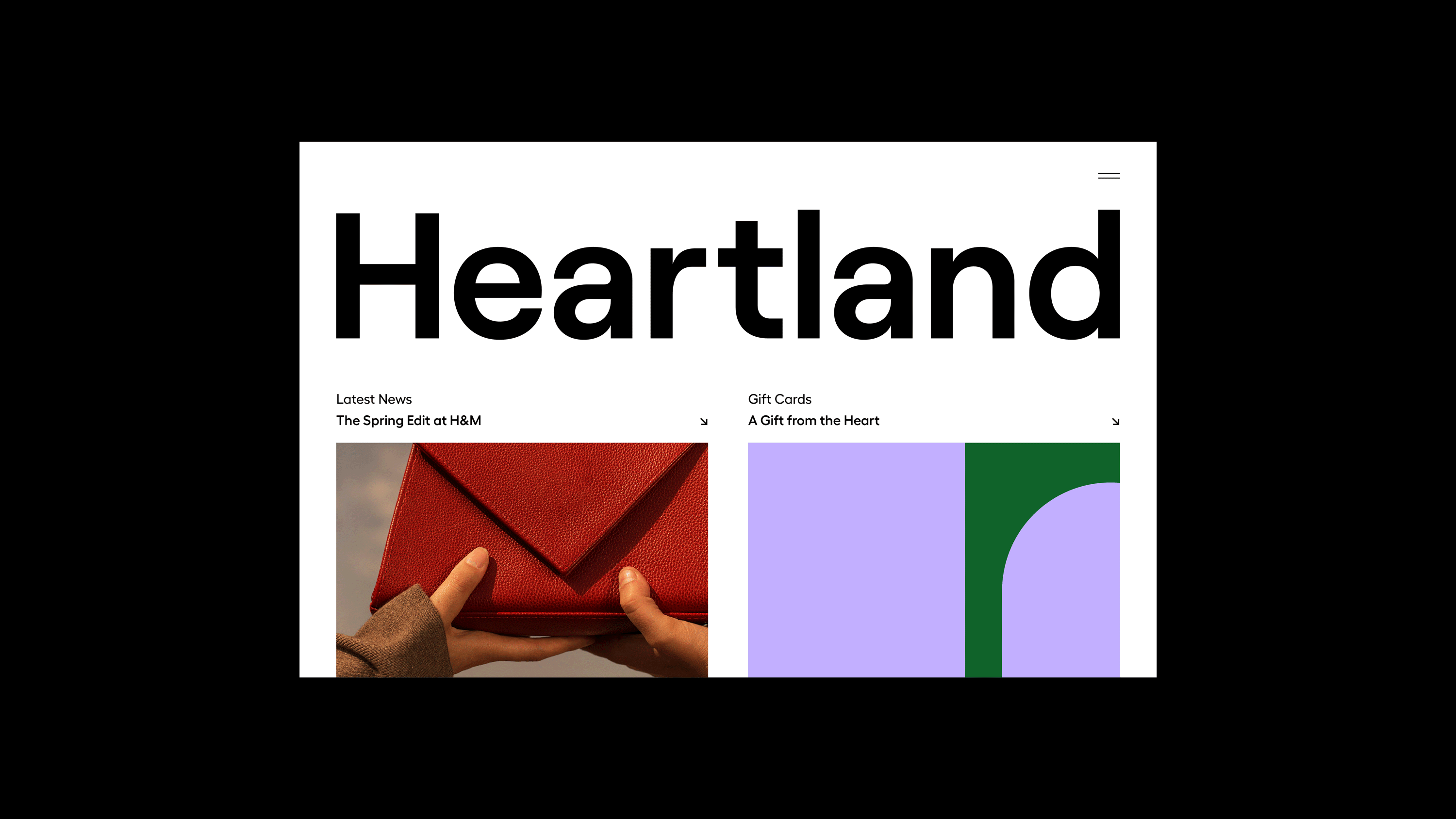
Heartland is one of Canada’s largest power centres, bringing together retail shops and specialty services in one convenient location. With over 190 storefronts occupying 2 million square feet of real estate, Heartland is the ultimate destination to shop, eat, and work. Located in Mississauga, the district attracts countless visitors per day due to its proximity to nearby residential, industrial, and office buildings. Mississauga is one of the fastest-growing cities in Canada and in 2021, Ontario had a projected growth rate of 4.5 percent, restoring the economy from the year prior.
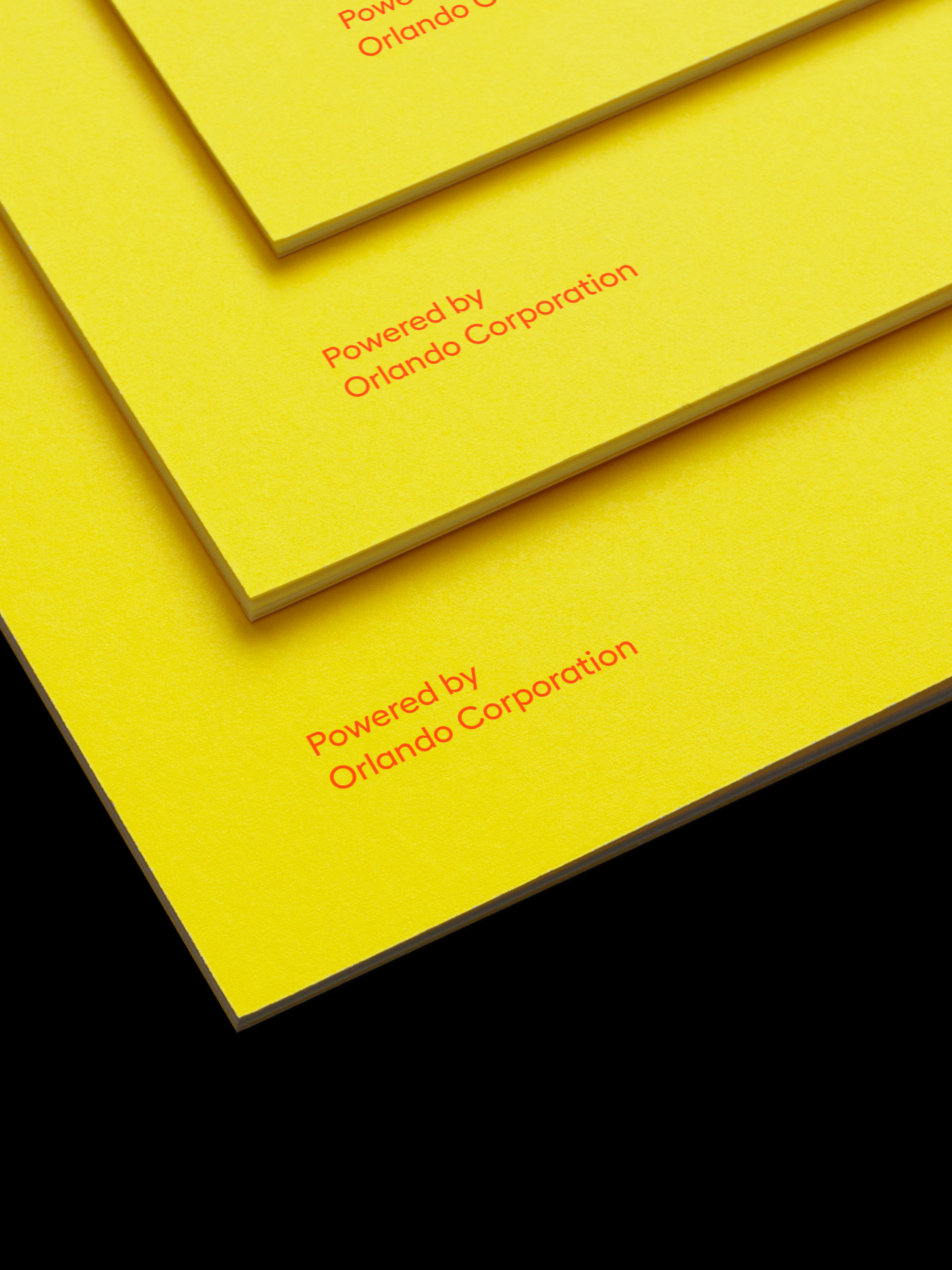
Vanderbrand was approached by Orlando Corporation to deliver a rebrand for Heartland that would revitalize one of the most iconic districts in the city. The repositioning of Heartland as a landmark destination acts as a catalyst for growth by creating opportunities for new tenants and visitors alike. To strengthen the Heartland brand as a growing precinct, a new brand identity, typographic system, colour palette, and graphic language was developed to work across various outputs and brand applications.
Heartland is one of Canada’s largest power centres, bringing together retail shops and specialty services in one convenient location. With over 190 storefronts occupying 2 million square feet of real estate, Heartland is the ultimate destination to shop, eat, and work. Located in Mississauga, the district attracts countless visitors per day due to its proximity to nearby residential, industrial, and office buildings. Mississauga is one of the fastest-growing cities in Canada and in 2021, Ontario had a projected growth rate of 4.5 percent, restoring the economy from the year prior.
Vanderbrand was approached by Orlando Corporation to deliver a rebrand for Heartland that would revitalize one of the most iconic districts in the city. The repositioning of Heartland as a landmark destination acts as a catalyst for growth by creating opportunities for new tenants and visitors alike. To strengthen the Heartland brand as a growing precinct, a new brand identity, typographic system, colour palette, and graphic language was developed to work across various outputs and brand applications.
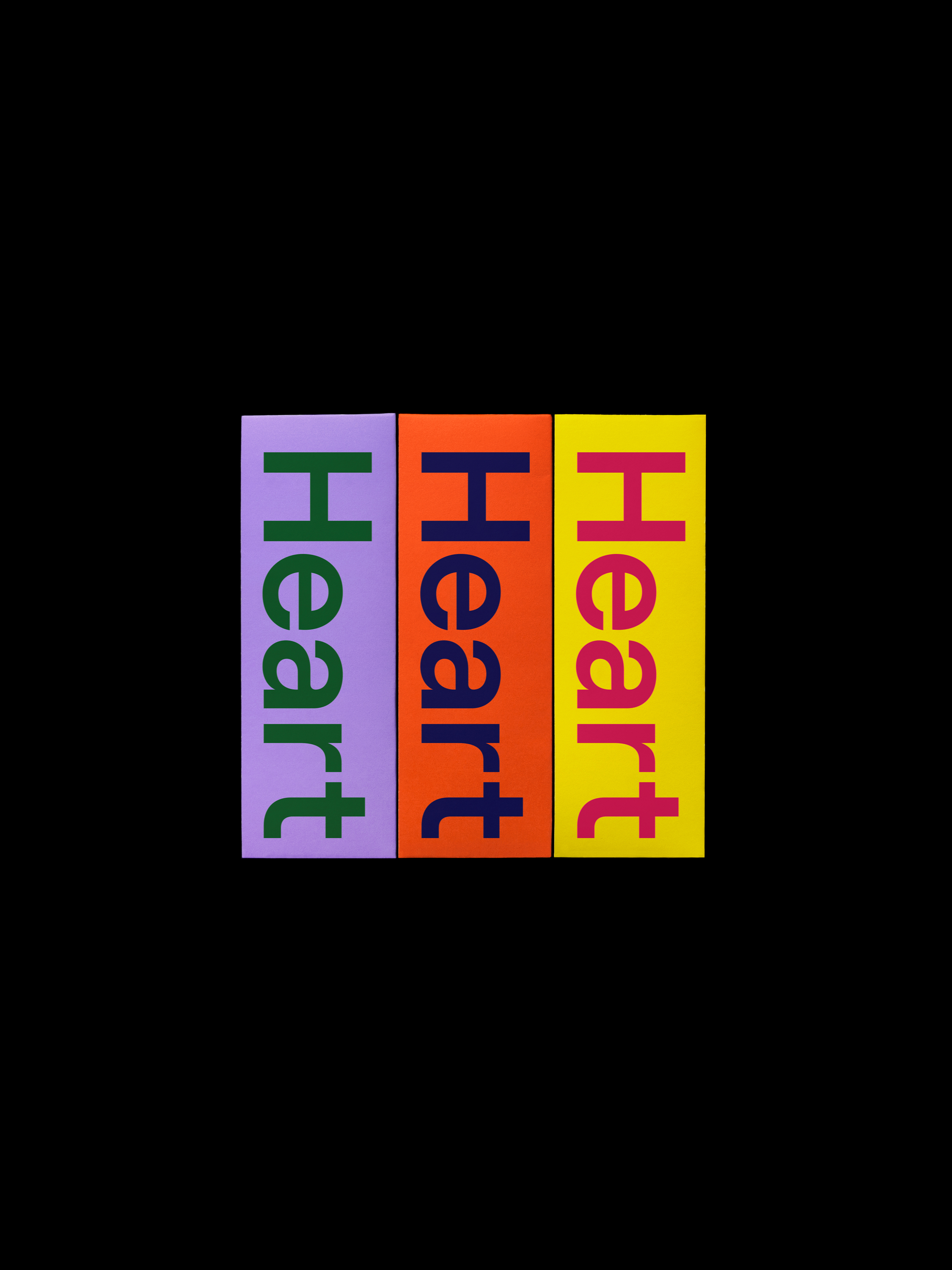
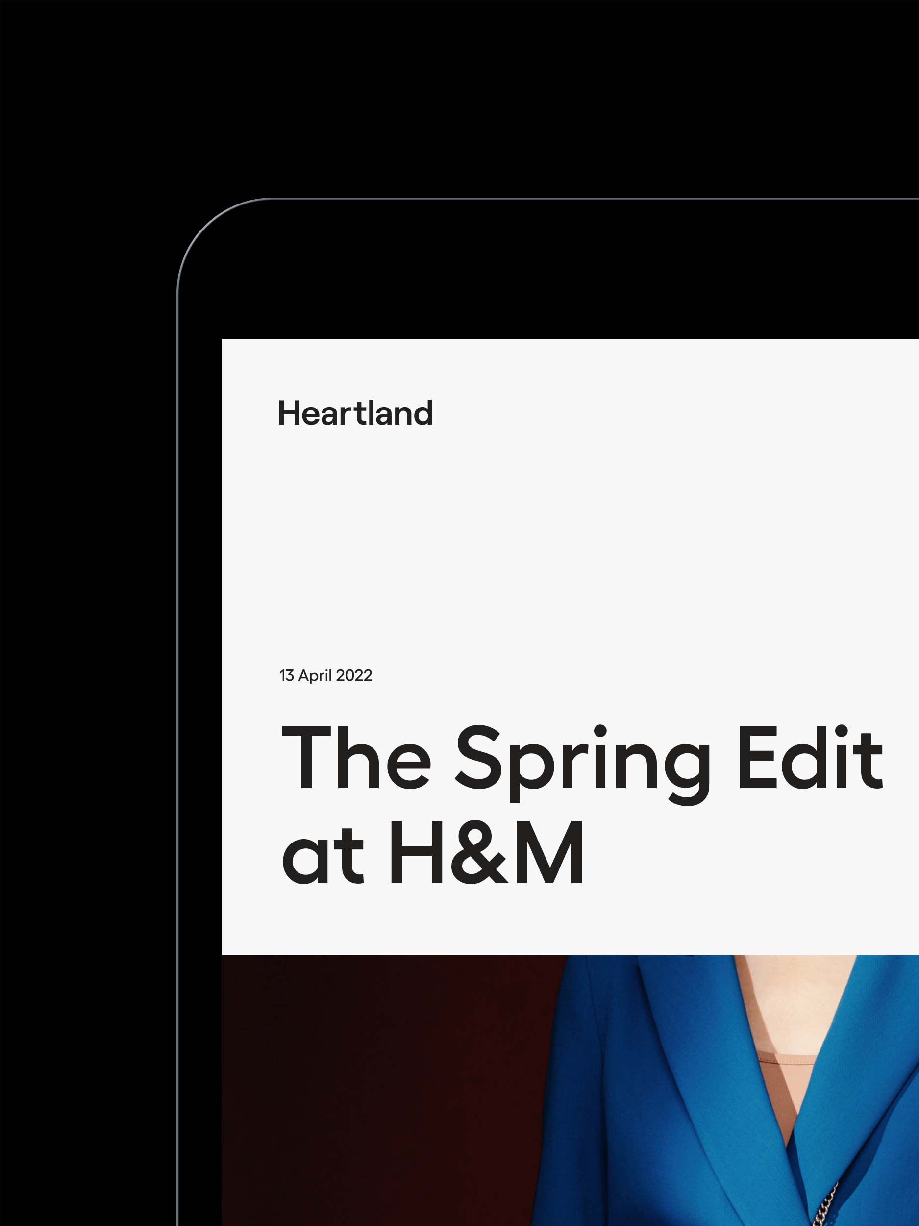
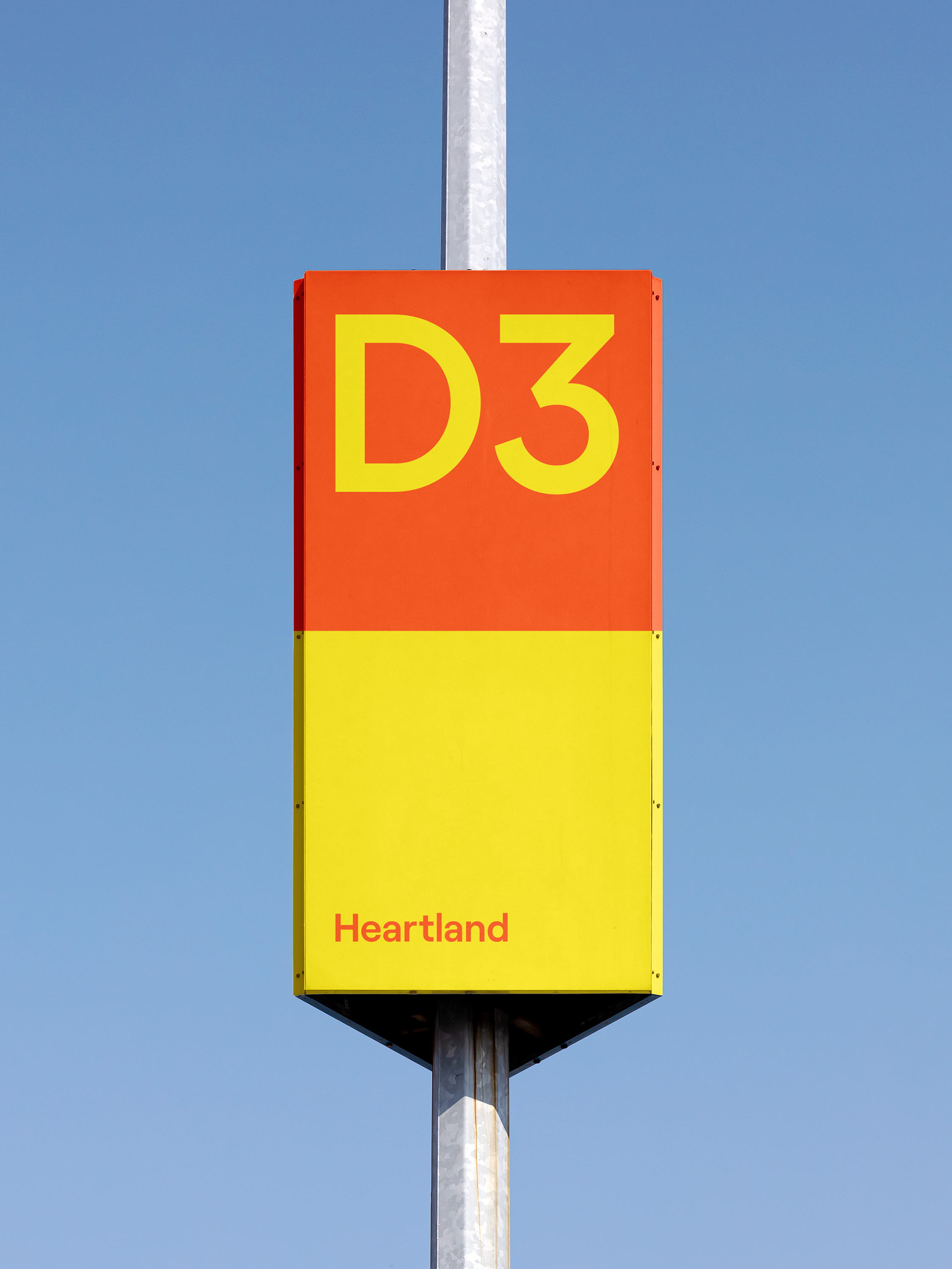
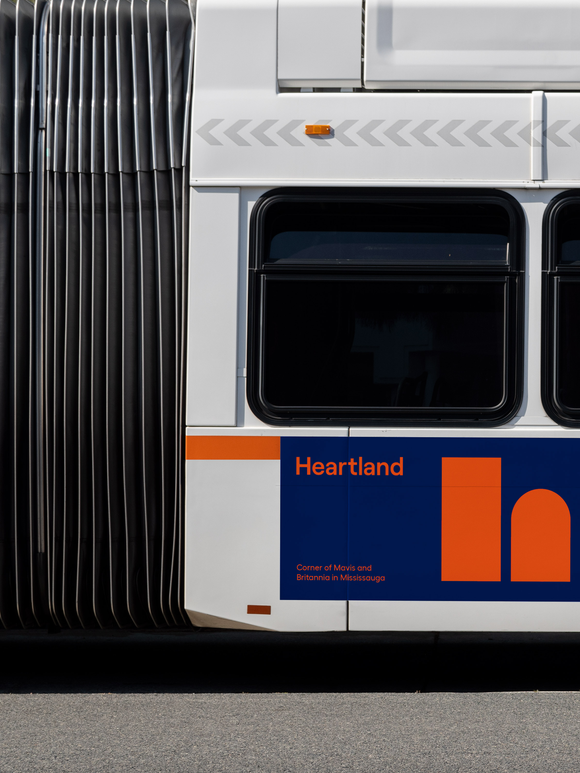
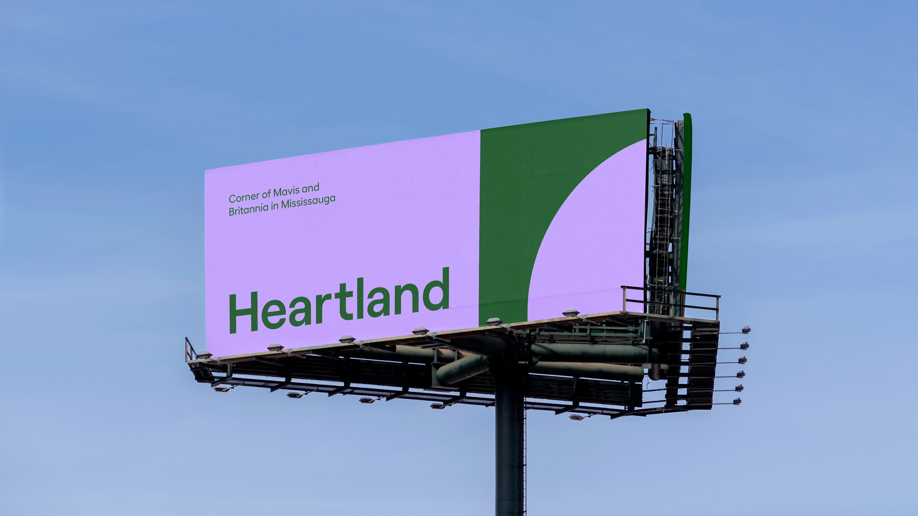
Retaining the Heartland name as well as its brand equity, the new wordmark sits forward and is set in a bold sans serif typeface which grounds the mark horizontally. The wordmark is paired with an icon which features abstracted shapes based on a lowercase ‘h’. The icon represents the storefronts and architectural motifs found in Heartland, as the precinct is well known for being an open concept neighbourhood with high-profile street-front retail locations. The combination of these two brand elements creates a foundation for a distinctive visual language.
Retaining the Heartland name as well as its brand equity, the new wordmark sits forward and is set in a bold sans serif typeface which grounds the mark horizontally. The wordmark is paired with an icon which features abstracted shapes based on a lowercase ‘h’. The icon represents the storefronts and architectural motifs found in Heartland, as the precinct is well known for being an open concept neighbourhood with high-profile street-front retail locations. The combination of these two brand elements creates a foundation for a distinctive visual language.
Retaining the Heartland name as well as its brand equity, the new wordmark sits forward and is set in a bold sans serif typeface which grounds the mark horizontally. The wordmark is paired with an icon which features abstracted shapes based on a lowercase ‘h’. The icon represents the storefronts and architectural motifs found in Heartland, as the precinct is well known for being an open concept neighbourhood with high-profile street-front retail locations. The combination of these two brand elements creates a foundation for a distinctive visual language.
Retaining the Heartland name as well as its brand equity, the new wordmark sits forward and is set in a bold sans serif typeface which grounds the mark horizontally. The wordmark is paired with an icon which features abstracted shapes based on a lowercase ‘h’. The icon represents the storefronts and architectural motifs found in Heartland, as the precinct is well known for being an open concept neighbourhood with high-profile street-front retail locations. The combination of these two brand elements creates a foundation for a distinctive visual language.
Retaining the Heartland name as well as its brand equity, the new wordmark sits forward and is set in a bold sans serif typeface which grounds the mark horizontally. The wordmark is paired with an icon which features abstracted shapes based on a lowercase ‘h’. The icon represents the storefronts and architectural motifs found in Heartland, as the precinct is well known for being an open concept neighbourhood with high-profile street-front retail locations. The combination of these two brand elements creates a foundation for a distinctive visual language.


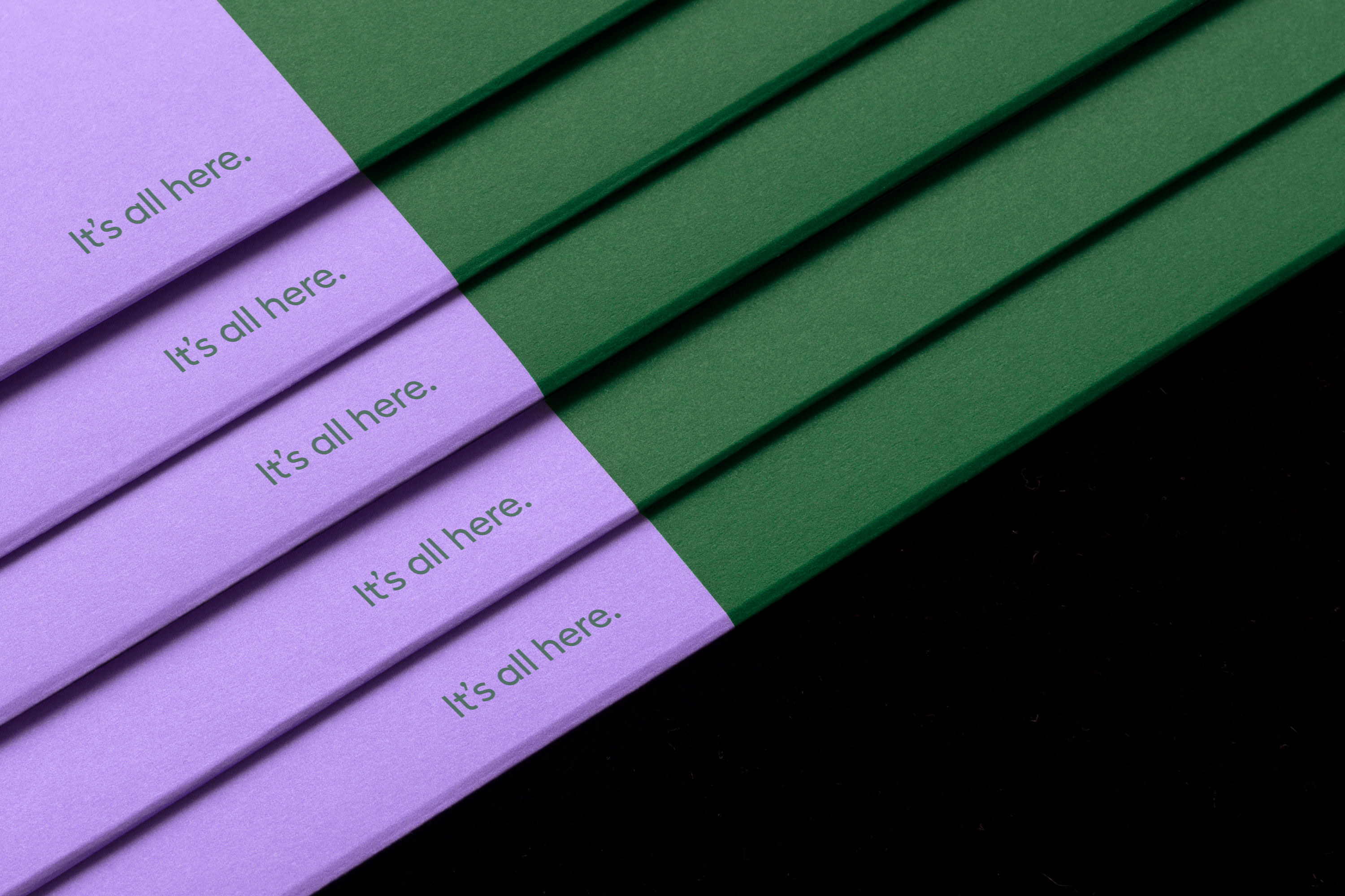
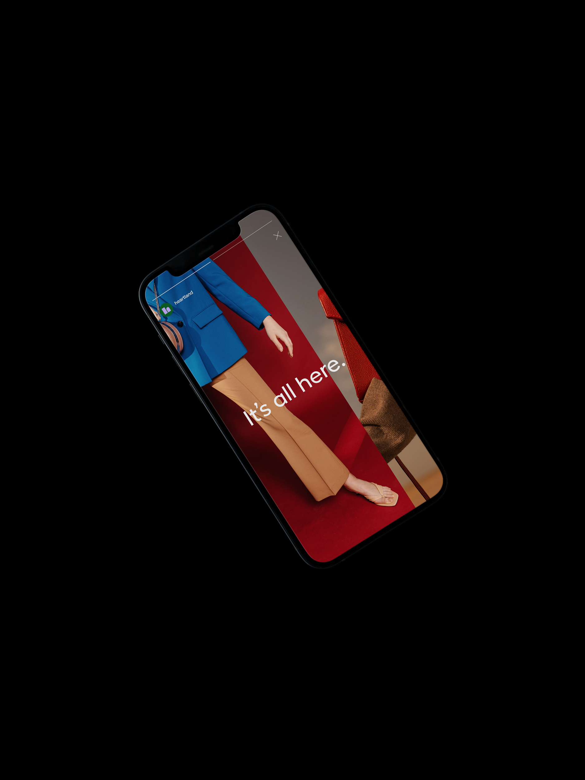
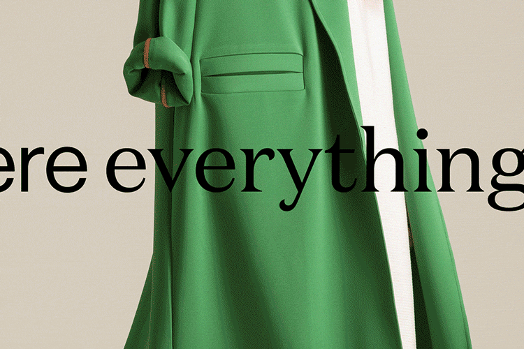
Heartland and the surrounding area is home to major corporations and flagship stores as well as small businesses and new-to-market concept stores. It was fundamental to develop a new brand message for the neighbourhood that would inspire a broad audience and create a space that is welcoming to all. Vanderbrand established “It’s all here” as a simple statement to capture exactly that, while also highlighting Heartland as a preeminent destination.
Heartland and the surrounding area is home to major corporations and flagship stores as well as small businesses and new-to-market concept stores. It was fundamental to develop a new brand message for the neighbourhood that would inspire a broad audience and create a space that is welcoming to all. Vanderbrand established “It’s all here” as a simple statement to capture exactly that, while also highlighting Heartland as a preeminent destination.
Heartland and the surrounding area is home to major corporations and flagship stores as well as small businesses and new-to-market concept stores. It was fundamental to develop a new brand message for the neighbourhood that would inspire a broad audience and create a space that is welcoming to all. Vanderbrand established “It’s all here” as a simple statement to capture exactly that, while also highlighting Heartland as a preeminent destination.
Heartland and the surrounding area is home to major corporations and flagship stores as well as small businesses and new-to-market concept stores. It was fundamental to develop a new brand message for the neighbourhood that would inspire a broad audience and create a space that is welcoming to all. Vanderbrand established “It’s all here” as a simple statement to capture exactly that, while also highlighting Heartland as a preeminent destination.
Heartland and the surrounding area is home to major corporations and flagship stores as well as small businesses and new-to-market concept stores. It was fundamental to develop a new brand message for the neighbourhood that would inspire a broad audience and create a space that is welcoming to all. Vanderbrand established “It’s all here” as a simple statement to capture exactly that, while also highlighting Heartland as a preeminent destination.
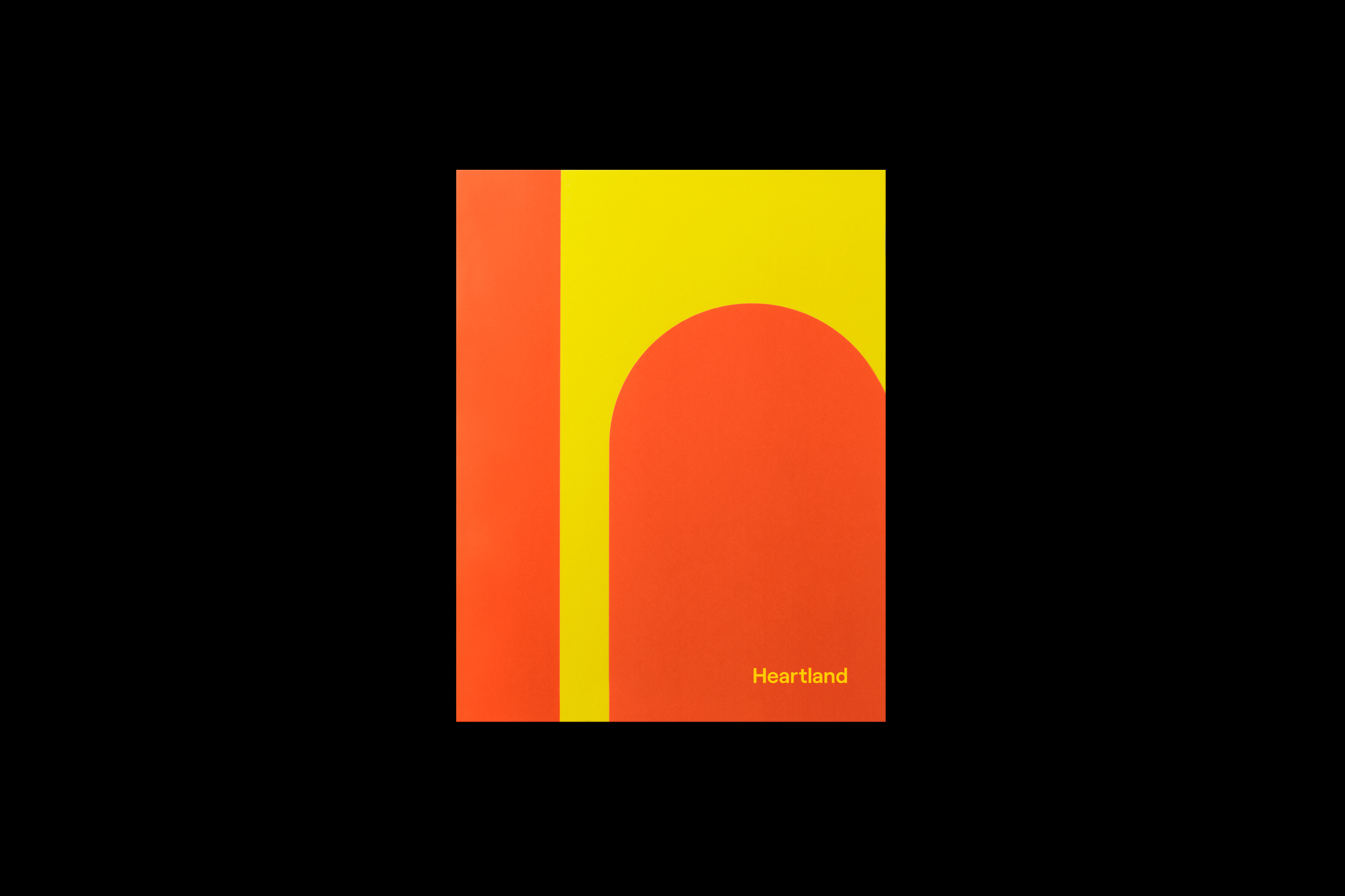
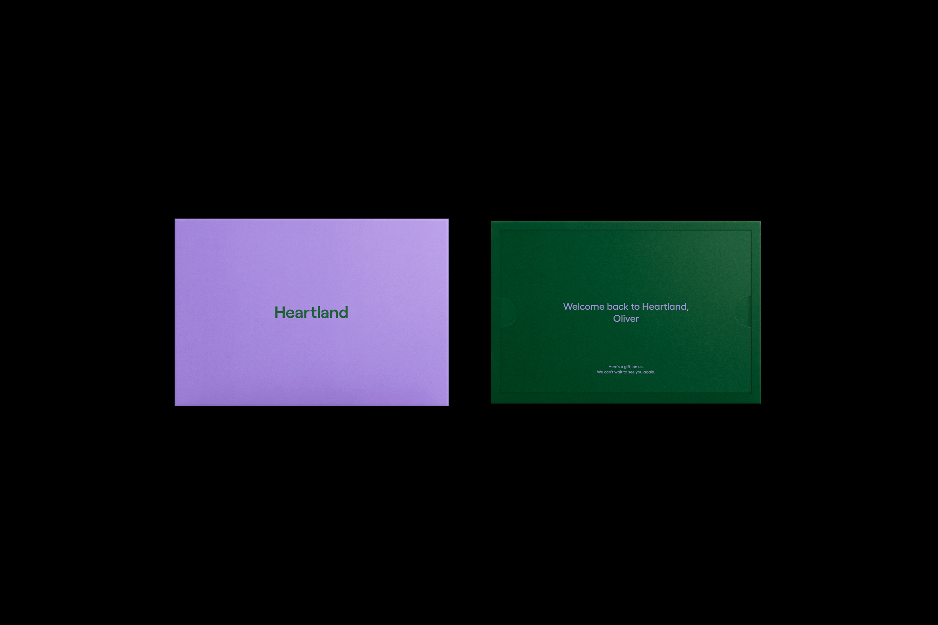
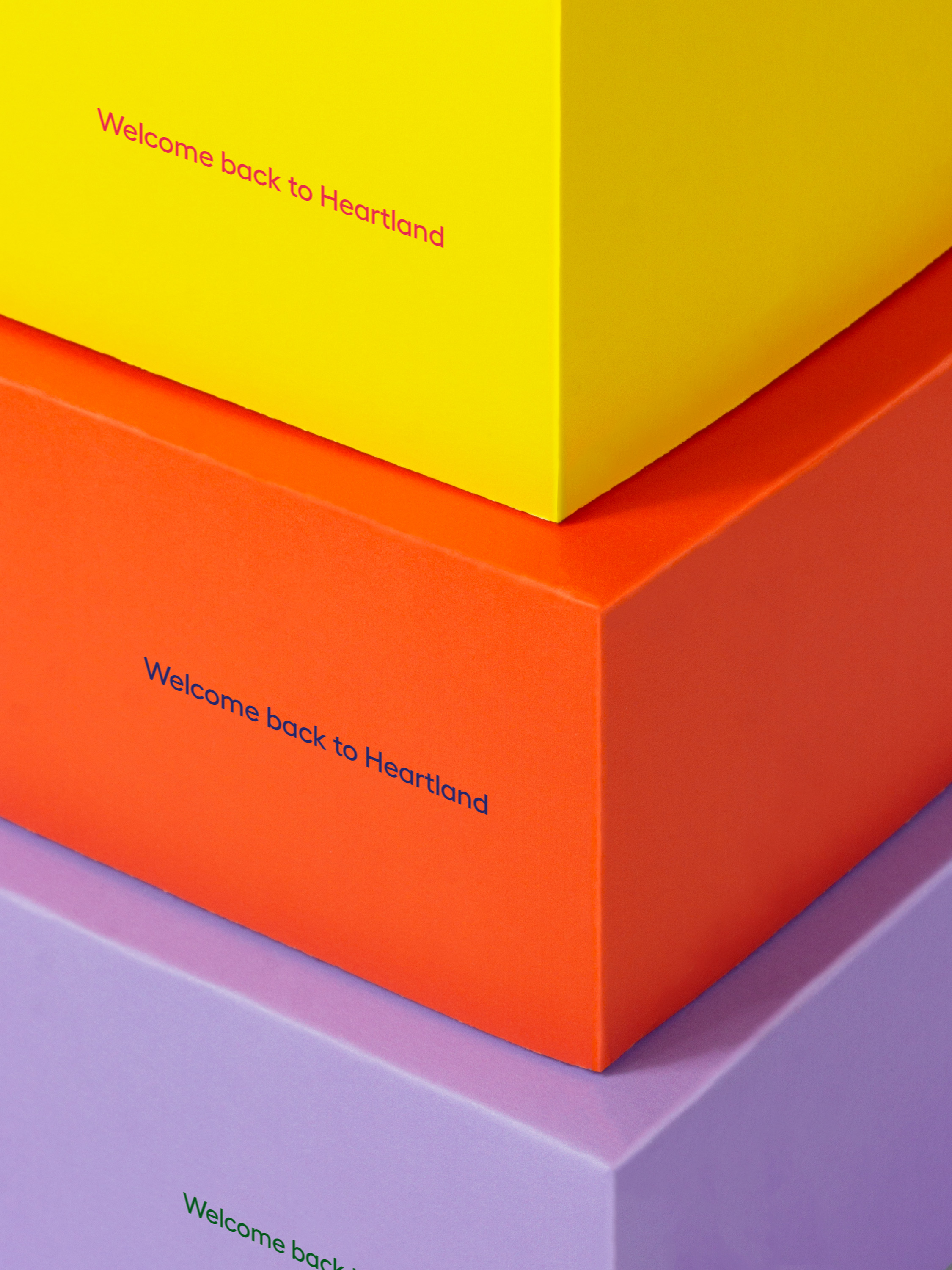
To bring vibrancy and energy back to Heartland, a spectrum of colours is introduced to capture the attention of new and old visitors. A flexible system of bold colour pairings and expressive compositions expands across various applications and establishes a unified brand presence.
To bring vibrancy and energy back to Heartland, a spectrum of colours is introduced to capture the attention of new and old visitors. A flexible system of bold colour pairings and expressive compositions expands across various applications and establishes a unified brand presence.
To bring vibrancy and energy back to Heartland, a spectrum of colours is introduced to capture the attention of new and old visitors. A flexible system of bold colour pairings and expressive compositions expands across various applications and establishes a unified brand presence.
To bring vibrancy and energy back to Heartland, a spectrum of colours is introduced to capture the attention of new and old visitors. A flexible system of bold colour pairings and expressive compositions expands across various applications and establishes a unified brand presence.
To bring vibrancy and energy back to Heartland, a spectrum of colours is introduced to capture the attention of new and old visitors. A flexible system of bold colour pairings and expressive compositions expands across various applications and establishes a unified brand presence.
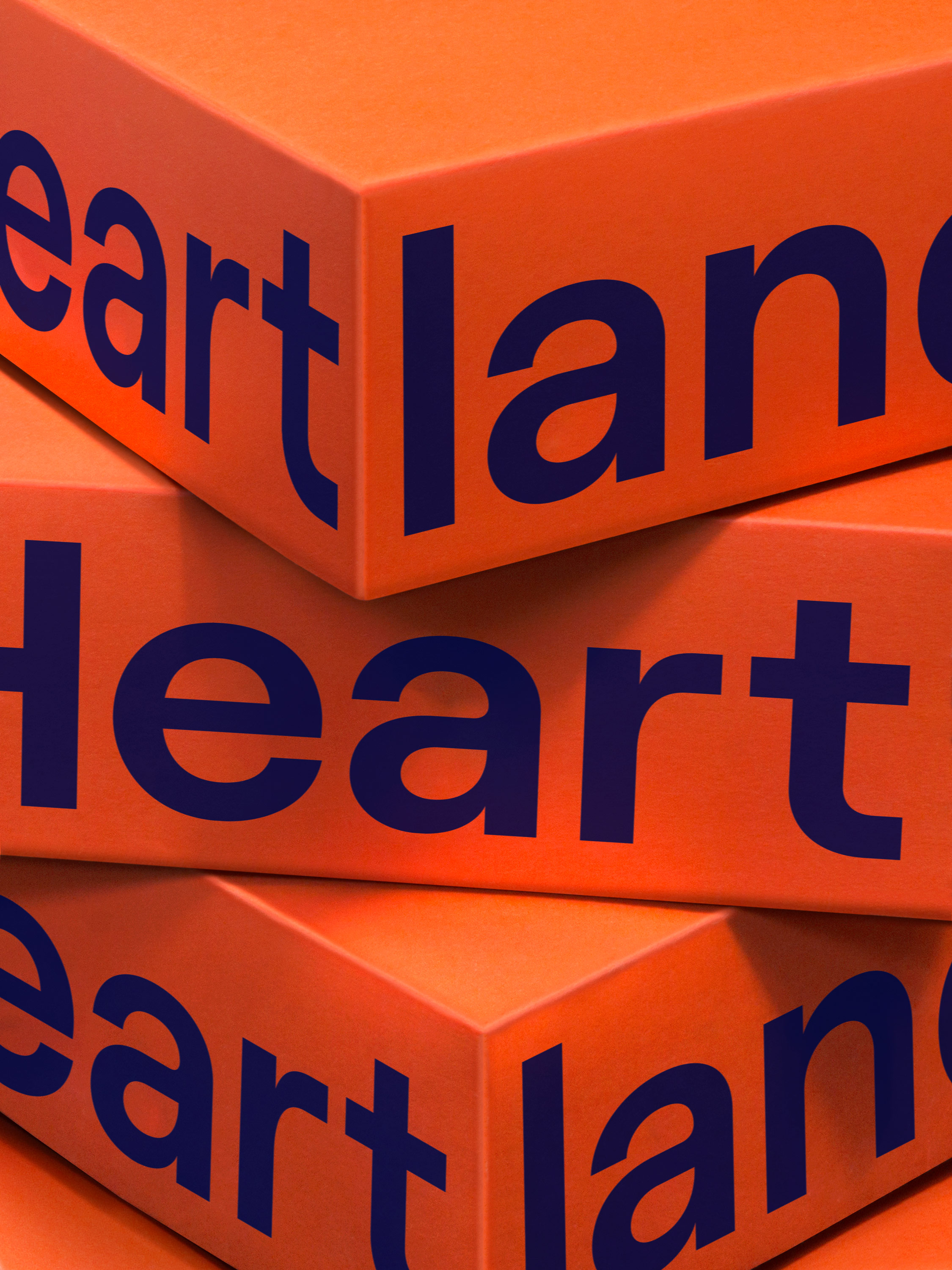
As part of the rebrand, it was important to generate excitement and create an optimistic brand narrative with the reopening of Heartland after months of city-wide closures. The graphic language exaggerates the clean geometry of the icon by using it at a super-scale size, often at different proportions, to create vibrant blocks of colour and allow for visual dynamism across Heartland’s visual communications.
As part of the rebrand, it was important to generate excitement and create an optimistic brand narrative with the reopening of Heartland after months of city-wide closures. The graphic language exaggerates the clean geometry of the icon by using it at a super-scale size, often at different proportions, to create vibrant blocks of colour and allow for visual dynamism across Heartland’s visual communications. .
As part of the rebrand, it was important to generate excitement and create an optimistic brand narrative with the reopening of Heartland after months of city-wide closures. The graphic language exaggerates the clean geometry of the icon by using it at a super-scale size, often at different proportions, to create vibrant blocks of colour and allow for visual dynamism across Heartland’s visual communications.
As part of the rebrand, it was important to generate excitement and create an optimistic brand narrative with the reopening of Heartland after months of city-wide closures. The graphic language exaggerates the clean geometry of the icon by using it at a super-scale size, often at different proportions, to create vibrant blocks of colour and allow for visual dynamism across Heartland’s visual communications.
As part of the rebrand, it was important to generate excitement and create an optimistic brand narrative with the reopening of Heartland after months of city-wide closures. The graphic language exaggerates the clean geometry of the icon by using it at a super-scale size, often at different proportions, to create vibrant blocks of colour and allow for visual dynamism across Heartland’s visual communications.

Awards
2022 Advertising and Design Club of Canada
Bronze Award
Rebrand
2022 Advertising and Design Club of Canada
Bronze Award
Complete Design Program
More Work
Constructing a brand for a design-driven builder
Constructing a brand for a design-driven builder
Constructing a brand for a design-driven builder
A new district, a growing city, a brilliant future
A new district, a growing city, a brilliant future
A new district, a growing city, a brilliant future